Action Pages with a URL Shortener The Complete Guide
Between "share a link" and "build a website" sits a gap most marketing falls into. The raw destination link needs no work but delivers no framing — no brand, no pitch, no urgency, just an address. The full landing page frames everything but costs a designer, a developer, a deployment and a week you may not have. What the gap wants is a third thing: a page that exists purely to present one decision well — a headline, a reason, maybe a video, maybe a clock, and one button. That third thing is what Cuttly calls an Action Page.
This guide is the complete manual: what an Action Page is and where it lives, every editable element from background to countdown, how the single CTA button and its per-plan destination rules work, what the built-in CTR analytics measure, and the playbooks — launches, signups, offers, waitlists — where one page with one button outperforms both a bare link and a full site. It opens a new chapter of our tools series alongside the Online Surveys pillar, and pairs with the URL Shortener the same way: the link is the distribution, the page is the destination.
What This Guide Covers
- What an Action Page is — and the deliberate discipline of exactly one button
- Where the page lives: the /c/ namespace on cutt.ly or your own branded domain
- Every editable element: template, backgrounds, logo, title, description, alias
- Video from YouTube or Vimeo, and when a page earns one
- The countdown — including the hide-at-zero option that enforces real offer deadlines
- CTA rules by plan: button text, destinations, and the auto-shortened target link
- Analytics: clicks by days, referrals, and CTR as the page's one number that matters
- Action Pages vs Link in Bio vs full landing pages — the decision map
- Playbooks: product launches, event signups, app downloads, offers and waitlists
- QR distribution and the offline-to-action pattern
- Managing the fixed page inventory: 3, 10 or 20 pages that live until deleted
- A worked example and a plan-by-plan guide
One Page, One Button: What an Action Page Is
An Action Page is a standalone call-to-action landing page available directly through a short link. Its address is the page: cutt.ly/c/launch on the shared domain, or your-domain.co/c/launch on a branded one. No hosting, no builder project, no deployment — the page is created and edited inside the same Cuttly dashboard that manages your links, and it is live at its alias the moment it exists.
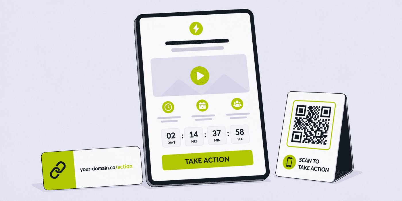
Its anatomy is deliberately short. A logo or profile image. A title and a description. A background — color, gradient, or your own uploaded graphic. Optionally, an embedded video from YouTube or Vimeo. Optionally, a countdown. And exactly one CTA button, with editable text, leading to exactly one destination. That last constraint is not a limitation waiting for a roadmap; it is the product's thesis. Pages fail mostly by asking for too many things, and a page that structurally cannot ask for more than one thing cannot fail that way.
The page belongs to the account's shared machinery from birth: it generates its own customizable QR code, its analytics sit in the same dashboard as the links', and its alias follows the same back-half discipline as everything in this series. Nothing about it is a separate product to learn — for anyone already running Cuttly links, an Action Page is a link that grew a face.
The single-button constraint does the strategic thinking for you. Building an Action Page forces the question every campaign should answer first and usually answers last: what, exactly, do we want this person to do? If the honest answer is "watch, understand, then tap this" — an Action Page is the right container. If the answer is a list, you want a different tool, and the decision map later in this guide says which.
Equally defining is what the format leaves out, on purpose. No forms — the button leads to wherever forms belong. No section stack, no testimonial carousel, no navigation to wander off through. An Action Page is not a small website; it is a large button with context. Teams sometimes read the missing pieces as immaturity until the CTR teaches the opposite lesson: every element a page does not have is an exit a visitor cannot take.
Where the Page Lives: The /c/ Namespace
Action Pages occupy their own path on the domain: /c/ plus your chosen alias. The alias is editable like any back-half, so the address reads as intent — cutt.ly/c/spring-offer, cutt.ly/c/webinar — and everything this series has established about readable addresses applies: the link is the first line of the pitch, seen in the message before the page is seen at all.
On branded custom domains, the page serves under your name: your-domain.co/c/launch. For a page whose whole job is to persuade, arriving on the domain the audience already knows is not cosmetic — it is the difference between "a page about the launch" and "the company's launch page." Setting up the domain itself is covered in the custom domains guide; once it carries your links, it carries your Action Pages with no additional work.
The Economics of the Middle Layer
It is worth pausing on why this middle layer between link and website earns its keep, because the cost asymmetry is the whole business case. A conventional campaign landing page carries fixed costs that repeat per campaign: design time, build time, review cycles, deployment, and a hosting footprint that someone maintains. Those costs are justified when the decision being sold needs three screens of persuasion. They are pure overhead when the decision needs one screen — and most campaign moments do: the drop, the signup, the offer, the announcement. For those, the conventional page's costs don't buy conversion; they buy delay.
An Action Page moves that entire moment to marginal cost near zero: dashboard work measured in minutes, no deployment, no maintenance, and deletion as clean as creation. The consequence is not just cheaper campaigns but more of them — the flash offer that wasn't worth a landing page project is worth an Action Page, the regional variant that wasn't worth a second build is worth a second alias. When the cost of dressing a moment properly approaches zero, moments that used to ship as bare links start shipping dressed, and the campaign calendar gets denser without the production calendar noticing.
Editing Live: The Page Is Never Frozen
Every element on the page — template, background, logo, title, description, alias, video, countdown, button text, button destination (within the plan's domain rules) — remains editable after publication, and the address holds still while the content moves. This inverts the conventional page's rhythm, where the URL is cheap and the content is expensive to change. Here the address is the durable asset — printed, shared, accumulated — and the page behind it is the adjustable part: the typo fixed mid-campaign, the sold-out variant's button retargeted, the description sharpened after the first day's CTR reading. The worked example later leans on this exact property, and so does every campaign that discovers, live, what its page should have said.
The Editable Elements, One by One
Template, Background and Logo
The page's look is assembled from an editable template, a background you control — flat color, gradient, or a custom image uploaded from your own files — and your logo or profile image at the top. The craft guidance is the same restraint that runs through this series: the background's job is to make the title and button legible while feeling like your brand, and the uploaded-image option is at its best with quiet, low-contrast art directly from your campaign's visual identity. A launch page whose background is the product photo and whose button carries the accent color is fully branded; more than that starts competing with the one thing the page exists to say.
Title, Description and the Word Budget
The title and description are the entire argument, and their brevity is enforced by the format: this is a page a person absorbs in seconds, usually on a phone, usually having tapped from a message or scanned from print. The working shapes — title as the offer or the moment ("The new collection arrives Friday"), description as the single best reason plus any essential logistics ("Early access for newsletter readers. 24 hours only.") — leave the button to close. Write the button text last, as the answer to the title: a title that promises early access earns a button that says "Get early access," not "Click here." The button's text is editable for exactly this reason.
Video: YouTube or Vimeo, and the Bar It Must Clear
A video from YouTube or Vimeo can sit on the page, and for the right campaigns it is the page: the trailer above the button, the demo above the signup, the founder's thirty seconds above the pledge. The bar it must clear is doing persuasive work the title cannot — a launch trailer clears it, a talking-head restating the description does not — because every element on an Action Page either moves the visitor toward the button or delays them on the way. When the video is the argument, the layout is already right: watch, then act, one screen, one motion.
The Countdown — Deadlines That Enforce Themselves
The countdown adds a clock to the page, and clocks change how offers read: a deadline visibly ticking is urgency no adverb can fake. The mechanism with real strategic weight is the option attached to it — hiding the CTA button once the countdown reaches zero. Configured this way, the deadline enforces itself: when the clock runs out, the button is gone, with no midnight republish and no awkward window where an "ends Sunday" offer is still quietly clickable on Tuesday. The page itself stays active either way — visitors arriving late see the page, the brand and the closed clock rather than a dead link — which is exactly the honest ending an expired offer should have.
For moments that begin rather than end — launches, openings, drops — the countdown works as the anticipation clock while the button works throughout: pre-launch it carries the action that exists now ("Join the waitlist", "Get notified"), and at the moment itself the button's text and destination are edited live in the dashboard, within the plan's destination rules. Same address before and after; one edit at the moment; the clock does the theater and the button does the business.
Your Privacy and Terms, Linked
An Action Page can carry an optional link to your own privacy policy and terms — the same posture the surveys side of this series treats as standard. For pages that open a purchase or a signup, the footer link keeps the page consistent with the obligations of whatever the button leads to, and it is one more signal, visible before the tap, that a real organization stands behind the offer.
The CTA Button: Rules of the One Link
The button's destination is editable, and its rules differ by plan in a way worth knowing before you architect a campaign. On Team and Team Enterprise, the CTA can point to any URL — your store, a ticketing platform, an app store listing, a partner's page. On Single, the destination must be a URL from the same domain — a page on cutt.ly points within cutt.ly's domain, a page on your branded domain points within your domain. For a Single-plan business running its Action Pages on its own branded domain and sending buttons to its own site, this constraint rarely bites; for campaigns whose buttons must reach third-party platforms, it is the concrete reason the Team tier exists in this feature's story.
One mechanical detail with a practical payoff: the destination link is automatically shortened by Cuttly. The button's target is itself a managed short link, which means the tap is measured with the same aggregated, anonymized click analytics as everything else in the account — the foundation of the CTR number the next section is about.
Measurement: CTR Is the Page's One Number
Because the page has one job, its measurement collapses to one honest ratio. Action Pages report click analytics — clicks by days, and referrals showing where visitors arrived from — and CTR: visits to the page against clicks on its CTA button. That ratio is the page's grade. Plenty of visits and a thin CTR means the page is reached but not persuading — the title, the video's length, the offer itself go under review. Strong CTR on thin visits means the page works and distribution is the constraint — the addresses and placements carrying it need the attention. One number, and you know which half of the campaign to fix; it is the opens-versus-completions diagnostic of the surveys guides, reborn for pages.
Analytics retention follows the plan: 180 days of history on Single, a full year on Team and Team Enterprise — enough, on the annual tiers, to compare this season's launch page against last season's. Referral data adds the channel picture on arrival, and for campaigns that want placement-level attribution beyond referrals, the pattern from the rest of this series applies unchanged: regular short links with per-channel back-halves pointing at the page's address, each placement its own door. The wider measurement thinking lives in the link analytics guide.
Reading CTR Across the Campaign's Life
The clicks-by-days view gives CTR a time axis, and campaigns read differently along it. In a launch's teaser week, the page's CTR measures the waitlist ask, not the sale — worth reading, but the pre-launch metric that matters most is the visit curve's shape: rising toward the date means the drumbeat is working. Launch day changes the button's job, and with it the metric's meaning; the first forty-eight hours of post-launch CTR are the campaign's verdict on message-to-page match. From there the tail tells the operational story — a CTR that holds as visits decay means the page keeps persuading whoever still arrives, while a CTR that sags with time usually means the offer's window has passed in the audience's mind even if the countdown still runs, which is the signal to either refresh the page's language (it edits live) or close the campaign with intent rather than letting it fade.
Referrals complete the read by naming where the visitors came from, and the feeder-link pattern refines it to placements. The habit worth keeping is the same weekly glance the surveys series recommends: two numbers per page — visits, CTR — against the calendar, with the deeper referral dive reserved for the campaign's close.
Designed for the Palm: The Mobile Contract
Nearly every path to an Action Page ends on a phone — the tapped message link, the social bio, the scanned code — and the format's constraints are mobile wisdom enforced. One screen of content because thumbs don't commit to scrolling for a pitch. One button because a palm-width screen ranks one action perfectly and two actions poorly. A title in a glance's worth of words because that is the reading window a phone in a queue affords. Building the page, the review ritual is therefore the same one the surveys series mandates: open the alias on the smallest phone available, in daylight, and check that the title lands without scrolling, the video doesn't shove the button below the fold, and the button falls where a thumb rests. The elements are all editable afterward, but the campaign's first impression only happens once.
The Decision Map: Action Page, Link in Bio, or Full Landing Page
Three tools, three shapes of intent. Link in Bio is a directory: many destinations, persistent, built for the follower who asked "where is everything?" — the social-profile home covered in the Link in Bio guide. An Action Page is a moment: one destination, framed, often dated, built for the campaign that asked "will you do this one thing?" A full landing page is an argument: sections, proof, forms, built for decisions heavy enough to need them. The costs scale the same way — Link in Bio and Action Pages are dashboard work measured in minutes; the full page is a project measured in days.
The practical test is the button count your message truly needs. Zero buttons, just information — that is a post, not a page. One button — Action Page, and the format will make it better by forbidding the second. Several buttons of equal standing — Link in Bio. One decision that needs three screens of convincing — the full page, and the Action Page may still serve as its short-lived campaign door. The deeper comparison with full landing pages gets its own guide later in this series.
Playbooks: Where One Button Wins
The playbooks share one construction rule worth stating once: each begins from the decision, works backward to the button, and only then dresses the page. Campaign teams habitually run the order in reverse — visuals first, copy second, "what's the link?" at the end — and the format quietly punishes it, because a beautiful page around an unclear ask still prints its grade in the CTR. Decision, button, title, description, then dressing; the playbooks below are that order applied to the recurring moments.
The Product Launch
Week minus one: the page goes live at your-domain.co/c/launch with the trailer, the title, the clock counting to launch morning — and a button that already works, carrying the pre-launch action: "Join the waitlist" or "Get notified", pointing at the signup. Every channel — social, newsletter, the Link in Bio slot, the QR on the poster — repeats the one address, and the teaser week banks signups instead of mere visits. Launch moment: one edit in the dashboard swaps the button's text and destination to the store ("Shop the drop"), within the plan's destination rules. The address never changes, so every share accumulated during the teaser week is a live sales link the minute the edit lands — and when the launch offer later ends, the countdown's hide-at-zero option retires the button on schedule, honestly.
Event and Webinar Signups
The event's essentials — name, date, one-line promise, optionally the speaker's thirty-second video — above a button reading "Save my seat," pointing at the registration platform (a Team-tier pattern when the ticketing is third-party). The page's countdown can run to the registration deadline or the event itself. This is the front door the events guide's link operation distributes, and the post-event survey from the post-event surveys guide is its closing symmetry: one page opens the event, one survey closes it.
The App Download Page
The app's icon as the logo, one sentence of what it does, the demo video, and a button to the store listing. The page gives campaigns a single stable address to promote while the analytics show which referrals actually produce store-bound taps — the CTR reading that raw store links never give you.
Offers, Drops and Seasonal Promotions
The seasonal calendar is where the fixed inventory earns a planning rhythm of its own: the year's known moments — the winter sale, the anniversary, the back-to-school window — can each have a page drafted in a quiet week and published into its slot when the season opens, aliases reserved in the naming convention from the start. Retail teams running the pattern across locations pair each season's page with per-store feeder links, and the referral-plus-feeder reading answers the perennial question of which store's counter cards actually move.
A time-boxed offer is an Action Page with a countdown running to the offer's end: the deadline is on screen, the button carries the offer's verb, and the QR on the shelf talker or the receipt makes the page the offline campaign's landing zone — the QR best practices applying to a page built to receive scans. When the clock hits zero, the offer's honesty is visible: the countdown said it would end, and it ended.
The Feedback Bridge
The two halves of this series meet in one small pattern: an Action Page whose button opens a survey. The post-campaign debrief page — "Tell us how the drop went," the button pointing at your-domain.co/s/drop-feedback — gives a feedback ask the same dressed, branded, one-decision treatment a launch gets, and suits moments when the ask deserves more framing than a bare survey link: the apology-and-listen page after a rough release, the community consultation from the protected surveys guide given a public front door. Page CTR then reads willingness to engage; the survey's own funnel reads the rest.
The Waitlist and the Announcement
Pre-product, pre-opening, pre-anything: a page whose title names the thing coming, whose description promises the one detail that matters, and whose button joins the list. For businesses that do not yet have a website — the food truck in permitting, the studio under renovation — the Action Page on a branded domain is, for now, the website: one page, professionally dressed, saying the one thing there is to say, at an address worth printing.
The Creator Announcement
Creators live in platforms that allow one link and audiences that decide in seconds — the native habitat of this format. The album pre-save, the video premiere (the trailer embedded, the countdown to premiere time, the button hidden until it), the merch drop, the course cohort opening: each is one page in the creator's visual language, rotated through the bio and the Link in Bio page as moments come and go. The stable pattern: the bio page is the creator's permanent directory, and the Action Page is the current moment pinned at its top — covered next.
The Hiring Push
A role the company urgently needs is a campaign, and campaigns deserve better than a jobs-board URL. Title as the role, description as the one-line pitch for the team, the hiring manager's thirty-second video doing what job descriptions cannot, and the button — "See the role" — pointing at the posting. The page gives the push a shareable, brandable address for employees' networks, and its CTR reads the pitch's pull before the applications arrive. Recruitment link operations continue in the recruitment and HR guide.
The Nonprofit Appeal
A giving campaign compressed to its essence: the cause's image as the background, the ask in the title, the ninety-second story as the video, the countdown to the matching deadline, and one button — "Give now" — to the donation platform (a Team-tier destination). The page's economics matter most here: organizations whose every design hour is donated get a campaign page for minutes of volunteer time, and the QR version puts the appeal on every printed piece the nonprofits guide already covers.
Action Pages and Link in Bio: The Standing Pattern
The two page products are colleagues, not rivals, and their standing pattern is worth naming because it runs itself once set. The Link in Bio page is the audience's permanent address — the directory that answers "where is everything." The current Action Page occupies that directory's top slot for as long as its moment lasts: the drop page during launch month, the event page until the event, the appeal until the matching deadline. Followers learn one habit — the bio always has the current thing first — and the operator learns one motion: new moment, new Action Page, swap the top link, delete the old page when its export is filed. The bio provides the permanence the Action Page deliberately lacks; the Action Page provides the urgency a directory cannot express; and both live in the same dashboard, on the same domain, measured in the same account.
QR and the Offline-to-Action Pattern
Every Action Page generates its own QR code, customizable like the rest of the account's codes, which completes a pattern the surveys side of this series proved offline: physical placement, one scan, one screen, one action. The poster carries the code and the printed your-domain.co/c/offer; the scan lands on a page that needs no scrolling and asks one thing; the CTR tells you whether the poster's promise and the page's delivery matched. Print production rules are unchanged from the QR surveys guide — contrast, size, the physical test — and the page-side discipline is matching the page's title to the poster's words, because a scan that lands on different language than it was promised reads as a wrong turn.
The Craft of the Sixty-Word Page
A format this small rewards writing habits of its own, and three carry most of the weight. Lead with the noun, not the brand. The logo already says who; the title's precious words go to what — "Early access opens Friday" beats "BrandName presents: early access." Let the countdown do the urgency. A visible clock makes "hurry," "don't miss out" and their exclamation marks redundant; urgency stated twice reads as pressure, urgency shown once reads as fact. This series' standing rule against hype earns its keep here more than anywhere — a page whose deadline is real, stated once, and honored when the clock dies builds the credibility that makes the next campaign's countdown believed. Write the description for the skeptic's one question. Every offer has one — what does it cost, do I need an account, when does it ship — and the description that answers it preemptively removes the hesitation the button would otherwise inherit.
And the honesty rule extends to the button's other side: the destination must be the thing the button named. "Get early access" leading to a homepage where the visitor hunts for the offer converts the page's earned momentum into a broken promise. The auto-shortened destination is editable; point it at the exact shelf, not the store's front door.
Trust at the Moment of the Tap
The tap on a CTA is a small act of trust — the visitor is leaving a page they can see for a destination they cannot — and the format's trust signals stack in the seconds before it. The branded domain in the address bar says who is asking. The logo confirms it on the page. The privacy and terms link in the footer says an accountable organization stands behind the offer. And the page's visible restraint — one claim, one clock, one button, no dark-pattern clutter — is itself a signal, because audiences have learned what manipulative pages look like and this format structurally cannot look like one. For businesses whose campaigns travel through messages and scans, where the first touch is always a link out of context, that accumulated legibility is the quiet asset: pages that look like this, at addresses that read like yours, teach an audience that your links are safe to tap.
Inventory Thinking: Pages That Live Until Deleted
The inventory also enables a modest testing practice within its means. Two slots, two aliases, the same offer framed two ways — video-led on one page, title-led on the other — with the feeder channels split between them, turns a launch week into a message test whose scoreboard is two CTRs side by side. It is not a statistics suite and should not pretend to be; it is the campaign asking its audience which frame lands, at the cost of one spare slot and an hour of setup, with the winner inheriting the remaining schedule. Teams that run this once rarely go back to guessing.
Action Page limits are fixed inventory, not monthly allowances: 3 pages on Single, 10 on Team, 20 on Team Enterprise, each existing until you delete it. This shapes the operating habit. The Single plan's three slots are a rotation — the current campaign, the standing evergreen page (the app download, the signup), and one in preparation — with each closed campaign's page deleted after its final export to free the slot. Team's ten slots let campaigns overlap across a calendar or a small portfolio of brands; Team Enterprise's twenty carry an agency's client roster or a multi-brand company's whole promotional layer. In every case the discipline is the same one the surveys series applies to its own fixed budgets: slots are spent on live intentions, not parked on nostalgia.
A Worked Example: The Four-Week Launch
A small consumer brand on the Team plan, launching a product on the first of the month. Week one: the Action Page is built in an afternoon — product hero shot as the background, logo, title ("The one you asked for. October 1."), the forty-second trailer, a countdown to launch morning, and a CTA that works from day one: "Join the waitlist", pointing at the store's signup page. The alias is your-domain.co/c/drop; the page's QR goes to the print files for the two retail partners' counter cards.
Weeks two and three: every channel repeats one address. Three regular short links with channel back-halves — your-domain.co/social-drop, your-domain.co/mail-drop, your-domain.co/print-drop — all pointing at the page, so the teaser period's traffic arrives pre-attributed alongside the page's own referral data. Launch morning: one edit in the dashboard — the button becomes "Shop the drop" and its destination becomes the product URL, which the Team plan's any-URL rule allows. The countdown hits zero, the clock's job is done, and the address every share has been carrying for two weeks becomes the point of sale without a single link changing hands.
Mid-campaign, one live edit: day two's reading shows healthy visits and a soft CTR, and the description's second sentence — shipping details — turns out to be the skeptic's question asked too late, buried under the trailer. The description is reordered in the dashboard, shipping first; the address, the shares and the printed codes never notice. Day three's CTR confirms the fix. This is the live-editing property doing campaign work: the page adjusted to what the traffic taught, mid-flight, at zero cost.
The closing week: the launch offer ends Sunday, so the countdown gets its second job — reset to Sunday midnight with the hide-at-zero option on. When the clock runs out, the button retires itself; the page stays up as the drop's landmark until the team files the export, deletes the page, and returns the slot to the inventory for November's campaign.
Week four: the CTR tells the story — visits against button taps, day by day, channel by channel through the feeder links. The page stays up while the campaign's long tail runs; at month's end the analytics are reviewed against the 1-year retention window's previous drop, the page is deleted, and the slot returns to inventory with the next campaign's teaser already drafted.
The Pre-Publish Checklist
Ten items, five minutes, run before any address ships:
- 1. One decision named. You can state the page's single ask in one sentence, and the button says it.
- 2. The alias reads as intent.
/c/spring-offer, not/c/x7Qz3m— the address is the first frame. - 3. Title leads with the noun. The offer or moment, not the brand name the logo already carries.
- 4. The skeptic's question answered. The description handles the one hesitation the audience will have.
- 5. Button answers title. Same vocabulary, active verb, no "click here."
- 6. Destination is the exact shelf. The button's promise, kept one tap later — and mind the Single plan's same-domain rule.
- 7. Video earns its seat or leaves. It argues something the title cannot, or the page is faster without it.
- 8. Countdown tied to a real change. A real launch, a real end — with hide-at-zero where the offer truly closes — or no clock.
- 9. Privacy and terms linked where the button opens a purchase or signup.
- 10. The phone test passed. Smallest screen available: title without scrolling, button under the thumb, one motion from land to tap.
The Format on One Page
Compressed: an Action Page is one decision, dressed. It lives at a readable alias on the /c/ path — yours, on a branded domain — and everything on it exists to move a phone-holding visitor from arrival to one tap: noun-first title, skeptic-proof description, a video only when it argues, a clock only when the deadline is real, a button that repeats the title's promise and lands on the exact shelf. It costs minutes, edits live, retires its own deadlines, measures itself in one honest ratio, and dies cleanly when the export is filed — freeing a slot in a fixed inventory that keeps every page an active intention. The link carries the moment; the page frames it; the CTR grades it.
Common Mistakes with Action Pages
- Fighting the format. Cramming three offers into the description because there is only one button. The page carries one decision; campaigns with several belong in Link in Bio or a full page.
- Button text from the void. "Click here" under a title that promised early access. The button answers the title, in the title's words.
- Video as decoration. A clip that restates the description delays the tap it should be earning. If it isn't the argument, cut it.
- Countdown to nothing. A clock that reaches zero and changes nothing teaches visitors your deadlines are theater. Tie it to a real moment, and use hide-at-zero when the offer truly ends.
- Planning third-party buttons on Single. The same-domain rule is stated; discovering it mid-campaign is not. Architect the destination before choosing the tier.
- The random alias.
cutt.ly/c/x7Qz3mon a page whose whole craft is framing. The alias is the first frame. - Mismatched scan language. A poster promising "the drop" landing on a page titled something else. One vocabulary, print to page to button.
- Immortal campaign pages. Last season's offer holding a slot, its countdown long dead. Export, delete, rotate.
Cuttly Plan Guide for Action Pages
The Free plan ($0) and Starter plan ($12/month) do not include Action Pages — they cover the link, QR and survey foundations this series has built on, and Starter adds the branded domain that Action Pages will later serve under. For teams heading toward campaign pages, Starter is the sensible waypoint: the domain set up there is the address infrastructure the pages inherit on upgrade.
The Single plan ($25/month) opens the feature: 3 Action Pages with the full editing surface — template, backgrounds, logo, video, countdown with the hide-at-zero option, editable alias and button text — plus the page's QR code, customizable, and 180 days of click analytics with CTR. The one rule to plan around is the CTA destination staying on the same domain, which suits businesses whose buttons point at their own sites.
The Team plan ($99/month) lifts the two constraints that matter at campaign scale: the CTA can point at any URL — ticketing platforms, app stores, partners — and the inventory grows to 10 pages with a full year of analytics retention, enough to run overlapping campaigns and compare seasons. Multi-user access with roles puts the designer, the campaign owner and the analyst in one account.
The Team Enterprise plan ($149/month) carries 20 pages with the same any-URL buttons and 1-year retention — the tier for agencies running client campaigns and multi-brand organizations whose promotional layer is a portfolio rather than a page.
The first page is an afternoon's work with nothing to deploy: create a Cuttly account, and on the Single plan or above, build the page your current campaign is missing. Registration required; a free plan is available with no credit card needed for the platform's link, QR and survey foundations.
Frequently Asked Questions
What is a Cuttly Action Page?
A standalone call-to-action landing page living directly at a short link — cutt.ly/c/your-alias, or your-domain.co/c/your-alias on a branded domain. It carries a logo, title, description, customizable background, optional YouTube or Vimeo video, optional countdown, and exactly one CTA button with editable text and destination.
Which Cuttly plans include Action Pages?
From Single ($25/month) upward: 3 pages on Single, 10 on Team, 20 on Team Enterprise. Limits are fixed inventory — pages exist until deleted, nothing resets monthly. Free and Starter do not include the feature.
Can the CTA button link to any website?
On Team and Team Enterprise, yes — any URL. On Single, the destination must stay on the same domain. In all cases Cuttly automatically shortens the destination link, which is what makes the button's taps measurable.
How does the countdown work?
Add a clock counting to your chosen moment, and optionally hide the CTA button once it reaches zero — the clean way to enforce a real offer deadline. The page stays active regardless, so late visitors meet your brand and a closed clock rather than a dead link. For launches, run the clock as anticipation with a live button throughout, and edit the button's text and destination at the moment itself.
What analytics do Action Pages provide?
Clicks by days, referrals, and CTR — visits to the page measured against clicks on the CTA button, the single ratio that grades the page. Retention is 180 days on Single and 1 year on Team tiers, and all analytics are aggregated and anonymized, as across the platform.
Can an Action Page run on my own domain?
Yes — on branded custom domains, pages serve under your name with the /c/ path: your-domain.co/c/launch. The domain is set up once, from the Starter plan, and every page inherits it.
Do I need a website to use Action Pages?
No — the page is hosted by Cuttly and needs nothing deployed, which is why it serves as the interim website for businesses that don't have one yet. Note the Single plan's same-domain CTA rule when planning where the button leads; Team-tier pages can point anywhere.
- ACTION PAGES
- URL Shortener →
- Link in Bio Builder →
- QR Code Generator →
- This Series
- Action Pages by Cuttly
- Online Surveys — The Pillar Guide
- QR Code Surveys
- Related Guides
- Link in Bio — Complete Guide
- Custom Domains for Short Links
- Link Analytics — Complete Guide
- QR Code Best Practices
- Similar Verticals
- E-commerce
- Events & Conferences
- Small Business
- Encyclopedia
- Branded Links
- Link in Bio
- Verticals Hub
- URL Shortener for Every Industry →
- Start Here
- Create Free Account
- Plans & Pricing
URL Shortener
Cuttly simplifies link management by offering a user-friendly URL shortener that includes branded short links. Boost your brand’s growth with short, memorable, and engaging links, while seamlessly managing and tracking your links using Cuttly's versatile platform. Generate branded short links, create customizable QR codes, build link-in-bio pages, and run interactive surveys—all in one place.
Cuttly More Than Just a URL Shortener
Cuttly is a comprehensive, ever-evolving platform for link shortening that combines innovation and user-friendliness to deliver a seamless experience in managing and shortening URLs.


