QR Code Best Practices 2026: Size, Placement, Error Correction and Design
A QR Code that does not scan reliably is worse than no QR Code — it creates a negative experience at exactly the moment you wanted to create a positive one. Most QR Code failures are preventable. They result from specific, avoidable errors: a code that is too small for the scanning distance, a color combination with insufficient contrast, a quiet zone violated by surrounding design elements, a surface finish that creates glare, a logo overlay that exceeds safe size limits, or a static code whose destination has since changed. This guide is a comprehensive reference for everyone who creates, designs, or approves QR Codes — covering every dimension of best practice from the technical specification layer through to placement, surface, testing, and maintenance.
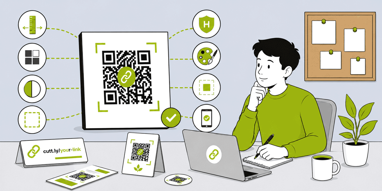
What This Guide Covers
- Dynamic vs static — the foundational best practice
- Size: minimum dimensions by scanning distance and context
- Error correction levels: L, M, Q, H — when to use each
- Color and contrast: rules, minimum ratios, what to avoid
- The quiet zone: what it is, why it matters, how to protect it
- Surface finish: gloss, matte, spot UV, foil, and scanning reliability
- Logo overlays: safe sizes, error correction requirements, testing
- Dot styles: which scan reliably and how choice affects perception
- Background compatibility: colors, gradients, photographs
- Placement: position, angle, context, call to action
- File formats: SVG vs PNG vs JPG — when to use each
- Scan testing: what to test, how, and when
- Maintenance: keeping QR Codes working over time
- The complete pre-print QR Code checklist
1. Dynamic vs Static: The Foundational Best Practice
Before any design decision, the most important QR Code best practice is this: use dynamic QR Codes for every URL-based application. This is not a design preference — it is an operational and technical requirement for any QR Code that will appear on printed materials.
A static QR Code encodes the destination URL directly in the matrix. The destination is permanently fixed at the moment of creation. If the URL changes — for any reason, at any time during the print run's lifecycle — the QR Code breaks. There is no recovery option except reprinting. Static codes generate no analytics.
A dynamic QR Code (generated by Cuttly from a short link) encodes only the short link URL — a stable, permanent pointer. The destination behind the short link can be updated at any time in Cuttly. Every scan is tracked automatically. The matrix is less dense (because the short link is shorter than most destination URLs), which improves scannability at small sizes.
The best practice is unambiguous: use dynamic QR Codes for every URL-based application, regardless of whether you currently intend to update the destination. The operational flexibility has zero incremental print cost, and the tracking provides data that is always useful. The only exceptions where static codes are appropriate: WiFi credentials and vCard contact data encoded directly (not via URL) in contexts where no tracking is needed and the data will never change.
2. Size: Minimum Dimensions by Context
QR Code size determines scanning reliability at any given scanning distance. The relationship is direct: larger codes scan from further away more reliably. The sizing rule: QR Code size in cm ÷ 10 ≈ maximum reliable scanning distance in meters.
| Context | Expected Scanning Distance | Absolute Minimum | Recommended |
|---|---|---|---|
| Business card | 10–20 cm | 2 cm × 2 cm | 2.5 cm × 2.5 cm |
| Product label (small, hand-held) | 10–20 cm | 2 cm × 2 cm | 2.5 cm × 2.5 cm |
| Handout / leaflet (A5, A4) | 20–35 cm | 2.5 cm × 2.5 cm | 3 cm × 3 cm |
| Table card / menu card | 25–40 cm | 3 cm × 3 cm | 3.5 cm × 3.5 cm |
| Product packaging (shelf) | 30–50 cm | 3 cm × 3 cm | 4 cm × 4 cm |
| A3 poster / wall display | 40–70 cm | 4 cm × 4 cm | 5 cm × 5 cm |
| Pull-up banner / event sign | 60–100 cm | 6 cm × 6 cm | 8 cm × 8 cm |
| Outdoor signage / billboard | 1–3 meters | 10 cm × 10 cm | 20 cm × 20 cm+ |
| Screen display (digital) | Screen dependent | 150 px × 150 px | 400 px × 400 px |
Key principle: err on the larger side. A QR Code that is 0.5 cm larger than the minimum is invisible to the user — no one notices. A QR Code that fails to scan is very visible — it creates a negative experience that the user consciously registers and associates with your brand. The marginal cost of a slightly larger QR Code in print production is effectively zero. The cost of consistent scanning failures is real.
Curved surfaces: QR Codes on curved packaging (bottles, tubes, cylindrical containers) require larger sizes than equivalent flat-surface placements, because perspective distortion reduces effective scanning reliability at a given size. For moderately curved surfaces, increase the recommended minimum by 30–50%.
Angle considerations: QR Codes on horizontal surfaces (table cards, floor decals) are scanned at a steeper angle than vertical surfaces. This reduces effective scanning reliability. For horizontal placements, increase minimum size by 20–30% above the equivalent vertical placement recommendation.
3. Error Correction Levels: L, M, Q, H
QR Code error correction adds redundant data modules to the matrix, allowing the code to remain scannable even when a portion is obscured, damaged, or printed with reduced quality. There are four levels, each tolerating a different maximum percentage of data module loss:
| Level | Name | Data Loss Tolerance | When to Use |
|---|---|---|---|
| L | Low | ~7% | Digital-only, clean screen display, no damage risk, no logo |
| M | Medium | ~15% | Standard digital use, on-screen QR Codes without logo |
| Q | Quality | ~25% | Print use where minor damage is possible, no logo |
| H | High | ~30% | All print use, any QR Code with logo overlay, outdoor use |
The universal print recommendation: always use H.
The trade-off for higher error correction is a denser matrix — more data modules are added to provide the redundancy. At any given QR Code version (grid size), H level produces a denser pattern than L level. However, for dynamic QR Codes encoding a short Cuttly link URL (20 to 30 characters), even at H level the matrix version is low and the density is very manageable — the density difference between H and M for a short link is minor.
Why H for all print: printed materials accumulate damage. Business cards are handled repeatedly, develop creases and corner damage. Product packaging receives scratches and scuffs in transit and on shelf. Flyers fold, tear, and get marked. Posters develop surface damage over time. H error correction provides the maximum resilience against all of these conditions, extending the scanning lifetime of a printed QR Code. The modest density increase is an invisible trade-off against this significant reliability benefit.
H is mandatory for logo overlays. A logo placed in the center of a QR Code obscures the data modules it covers. H error correction compensates for this by providing enough redundancy to reconstruct the obscured data. At lower error correction levels, a logo overlay will cause scanning failure. Always set H before adding any logo.
4. Color and Contrast: Rules, Ratios, What to Avoid
QR Code scanners work by detecting the contrast boundary between dark modules (dots) and the light background. The higher the contrast, the faster and more reliably the scanner identifies module boundaries and decodes the data. Color can be used freely in QR Codes — the requirement is contrast, not black-and-white.
The Contrast Rule
The minimum recommended contrast ratio between dots and background is 4:1. This is the same threshold used for web content accessibility (WCAG AA standard) and provides reliable scanning on virtually all mainstream smartphone cameras under typical lighting conditions.
Maximum contrast — pure black dots on pure white background — is always the most reliable choice. Brand-colored QR Codes work well when the color is sufficiently dark. Colors that consistently work well as dot colors against white: dark navy, dark forest green, deep burgundy, dark charcoal, deep plum, dark chocolate brown. The test: if the color looks dark and clearly distinguishable against white to the human eye, it is likely to meet the contrast requirement for scanning.
Colors to Avoid
Mid-tone colors (medium blue, medium green, medium grey, olive) do not provide sufficient contrast against white backgrounds for reliable scanning and should be avoided or tested extensively before print approval.
Pastel and light colors as dot colors are not scannable — they lack the contrast needed for scanner detection.
Reversed codes (light dots on dark background) can technically scan but reliability degrades significantly across older devices and in non-ideal lighting. Avoid for any print application where scanning reliability is critical.
Yellow and warm light colors as dot colors are particularly unreliable — yellow has low luminance contrast against white backgrounds and consistently produces scanning failures.
Red as a dot color can work in dark shades (deep red, crimson) but standard red has lower contrast against white than other dark colors and should be tested. On digital displays, standard red can cause issues with certain scanner algorithms.
Testing Your Color Choice
After setting a brand color, test the QR Code in Cuttly's preview by scanning with your phone under three conditions: bright daylight, indoor office lighting, and lower ambient light (a dimly lit room or restaurant environment). If it fails under any condition, increase the darkness of the dot color. A reliable rule of thumb: the dot color should look clearly darker than the background to a viewer at arm's reach under typical indoor lighting.
5. The Quiet Zone: What It Is and Why It Matters
The quiet zone is the mandatory clear margin around all four sides of a QR Code. The QR standard specifies a minimum quiet zone of 4 module widths on all sides. In practical terms at typical print sizes, this translates to approximately 2 to 5 mm of clear space around the QR Code pattern.
The scanner uses the quiet zone to detect where the QR Code begins and ends. It looks for the transition from light background to the first module of the QR Code pattern. If the quiet zone is violated by adjacent content — text, borders, design elements — the scanner cannot correctly identify the code boundary, and scanning fails. The failure is consistent, not occasional: a quiet zone violation that prevents scanning in one attempt will prevent scanning in most attempts under similar conditions.
How Quiet Zone Violations Happen in Professional Print Production
Quiet zone violations are the most common cause of QR Code failure in professionally designed materials. They happen in three typical ways:
A designer places text (the printed short URL, a call to action, an address line) too close to the QR Code, within the quiet zone rather than outside it. Fix: always place the printed URL and any surrounding text outside the quiet zone — below the QR Code with clear separation.
A decorative border, card frame, or background pattern extends into the quiet zone of the QR Code. Fix: specify explicitly in the design brief that the QR Code must have unobstructed clear space on all four sides.
The QR Code is positioned at the edge of the card, label, or panel, with the quiet zone on one or more sides falling at or beyond the material edge. Fix: the QR Code must be positioned with full quiet zone visible within the material boundaries — not flush with any edge.
Verifying the Quiet Zone
In every design proof review, look at the QR Code specifically and ask: is there clearly visible blank space on all four sides, between the edge of the QR Code pattern and the nearest other element? If yes, the quiet zone is intact. If any element is adjacent to or overlapping the QR Code pattern boundary, the quiet zone is violated and must be corrected before print approval.
In Cuttly's QR Code editor, the Margin setting controls the quiet zone built into the downloaded QR Code image. Set Margin to at least 1. Additional quiet zone in the surrounding design layout is still required — the Margin setting only adds space within the downloaded image file, not in the surrounding design.
6. Surface Finish: Gloss, Matte, Spot UV and Foil
The surface finish applied to printed materials significantly affects QR Code scanning reliability. This dimension is frequently underestimated by both designers and clients, and it is one of the most common causes of QR Code failure on professionally printed packaging and premium print materials.
Gloss Varnish (Standard)
Standard gloss varnish — the most common packaging and brochure finish — creates specular reflection under overhead lighting. Under typical retail fluorescent lighting, a gloss-varnished QR Code may produce a bright light hotspot on the area the camera needs to read. This does not always prevent scanning, but it increases the number of attempts required and can fail entirely for older cameras or in strongly lit environments.
Best practice for gloss-varnished materials: specify a spot matte varnish application over the QR Code area. This requires a matte-over-QR-Code mask in the print production specification — the rest of the material uses gloss, but the QR Code area uses matte. This is a standard print production instruction that most commercial printers can accommodate.
Spot UV Varnish
Never apply spot UV varnish over a QR Code. Spot UV creates a mirror-like reflective surface that completely prevents camera-based scanning under any typical lighting condition. This is the most reliably scanning-breaking finish error. It occurs when a designer applies spot UV across an entire design panel without considering the QR Code's functional requirements.
The correction: explicitly exclude the QR Code area from any spot UV specification. State this in the print brief, in the design file notes, and verify it on the physical proof.
Matte Varnish or Matte Laminate
Matte varnish and matte laminate diffuse light rather than reflecting it specularly. For QR Codes, matte finish is the most reliably scannable surface finish across all lighting conditions. If the choice is between gloss and matte for a packaging or document design that includes a QR Code, matte is the safer choice for scanning reliability. The visual trade-off (matte vs gloss aesthetics) should be considered against the scanning reliability benefit.
Foil and Metallic Finishes
Foil lamination and metallic ink create reflective surfaces with characteristics similar to spot UV — they prevent reliable scanning when applied over the QR Code area. The QR Code must be positioned away from foil treatment zones, or a clear non-metallic background zone must be specifically designated for the QR Code. If the design uses foil decoratively across the panel, position the QR Code in a section that is explicitly outside the foil treatment boundary.
Textured and Embossed Surfaces
Heavily textured surfaces (rough kraft paper, textured board, deep embossed areas) introduce surface variation that can interfere with module detection at the boundaries of each QR Code dot. For highly textured substrates, test the QR Code before committing to production. Increase size above normal minimum recommendations. Use high error correction (H). Consider using a smoother substrate zone for the QR Code area even if the surrounding material is textured.
7. Logo Overlays: Safe Sizes and Testing
Adding a logo to the center of a QR Code is a common and effective branding technique. Done correctly, it improves brand recognition and signals that the code is legitimate. Done incorrectly, it breaks scannability. The rules are specific and non-negotiable.
Error Correction Must Be H
Without H error correction, a logo overlay will cause scanning failure. H level provides up to 30% data loss tolerance — the logo obscures the modules it covers, and H's redundancy reconstructs those modules during scanning. At M or Q level, the logo can exceed the tolerance threshold and prevent scanning. Set H before adding any logo, always.
Maximum Logo Area
The logo should not exceed 30% of the QR Code's total area. In Cuttly's editor, the Image size setting represents the fraction of QR Code area covered: 0.3 = 30%, 0.4 = 40%. For print use, set Image size to 0.3–0.35. The maximum setting of 0.4 is achievable at H level, but 0.35 or below provides more comfortable margin, especially on print where ink spread or slight print quality variation can effectively increase the logo's visual footprint beyond its designed size.
Logo Margin
Set Image margin to at least 1–2 in Cuttly's editor. This creates a small buffer zone between the edge of the logo and the nearest QR Code modules. Without this margin, the logo's edge can visually merge with adjacent modules, creating ambiguity that reduces scanning reliability even within the H error correction tolerance.
Logo Design Considerations
Solid, simple logos scan more reliably than complex, detailed logos. A monogram, a solid geometric mark, or a simplified version of a full logo works better as a QR Code center element than a full-color detailed logo with fine text. The logo occupies a relatively small space (at 0.35 Image size, roughly 35% of the QR Code area, which at 2.5 cm means the logo space is approximately 1.5 cm × 1.5 cm). At that size, fine detail is not distinguishable — simplification improves both visual clarity and scanning reliability.
Transparent PNG logos (with transparent background) work correctly in the QR Code overlay. The logo appears on top of the QR Code's background color. A white-filled PNG logo creates a white square background for the logo — which integrates cleanly if the QR Code background is also white, but may be visually disruptive if the QR Code uses a non-white background.
Mandatory Scan Test After Adding Logo
Scan test the QR Code immediately after adding the logo in the editor, before downloading for print production. Test in the Cuttly editor preview on your phone. If it scans correctly: proceed to download. If it fails: reduce Image size, simplify the logo, or try a solid-color version of the logo instead of a full-color or detailed version.
8. Dot Styles: Which Work and Why
The visual appearance of the data modules — the individual dots that make up the QR Code pattern — can be customized in multiple styles in Cuttly's editor. Available options: Square, Dots, Rounded, Extra Rounded, Classy, Classy Rounded.
All six styles are scannable when used correctly with adequate size, contrast, and error correction. The differences are visual rather than functional at typical professional use sizes. Some practical guidance on when each works best:
Square: conventional, universally recognized, maximum clarity. Best for contexts where function is the priority and visual refinement is secondary: educational materials, healthcare forms, internal documents, safety labels. Maximum scanning reliability at minimum sizes.
Rounded: slightly softer appearance than Square, retains strong scanning reliability. Excellent general-purpose choice for branded materials where a contemporary appearance is appropriate without sacrificing reliability. Works well for business cards, event materials, marketing collateral.
Extra Rounded: more pronounced rounding, produces a notably softer visual character. Good for lifestyle, wellness, and consumer brand applications where the QR Code is part of a design aesthetic. Scans reliably at adequate sizes.
Dots: circular modules produce a distinctive, modern visual. Scans reliably at adequate sizes. The dot-to-dot spacing can create ambiguity at very small sizes (below 2 cm), so use 2.5 cm+ minimum for Dots style.
Classy: diagonal elements with a distinctive visual aesthetic. Creates a higher-end, design-forward appearance. Scans reliably at H error correction. Recommended minimum size is slightly larger than Square — use 3 cm+ for reliable scanning at small sizes.
Classy Rounded: Classy style with rounded elements. Premium appearance, same sizing recommendations as Classy.
Corner matching: set the corner square and corner dot styles to match or complement the chosen dot style. Rounded dots look best with Extra Rounded corners; Square dots look best with Square corners; Classy dots look best with matching corner styles. Visual coherence between dots and corners produces a more professional, intentional appearance.
9. Background Compatibility
The background behind the QR Code — both the QR Code's own background color and the design element it is placed over — determines scanning reliability.
Solid light background: always the safest choice. White or near-white background behind the QR Code, with dark dots, provides maximum contrast and scanning reliability in any lighting condition.
Brand color as background: works when the background color is light enough to maintain 4:1 contrast with the dot color. A light cream background with dark navy dots: works. A medium blue background with dark navy dots: poor contrast, avoid.
Photographic or illustrated backgrounds: do not place QR Codes directly on photographic or complex illustrated backgrounds. The variable luminance and color across the background creates scanning ambiguity. Place the QR Code in a dedicated box — a solid white or light-colored rectangle — that sits on top of the background image and provides a clean scanning surface.
Gradient backgrounds: a gradient that is light enough across the entire QR Code area can work, but gradients that shift from light to dark within the QR Code area create inconsistent contrast and reduce reliability. If using a gradient in the QR Code background, ensure the lightest part of the gradient meets the contrast requirement with the dot color.
10. Placement: Position, Context and Call to Action
Where a QR Code is positioned in a material — and how it is labeled — affects both scanning rate and the experience of scanning.
Position on the Material
For vertical print materials (business cards, flyers, posters): the back of the material or the lower section of the front. For horizontally read materials (brochures, packaging panels): wherever the reading flow naturally terminates — typically the back panel or the lower right section. The QR Code should be easy to find without searching, but should not compete visually with primary content (headline, product image, brand mark).
Avoid placing QR Codes: at the very edge of a material where quiet zone extends off the edge, on a fold line where the print surface is compressed or creased, in areas that are likely to be covered by stickers, labels, or price tags in retail settings, or in areas that receive handling damage (box bottom panels that sit on shelves and get scraped).
Call to Action — Specific, Not Generic
A QR Code with no label is an unexplained symbol. A generic label ("Scan me," "Scan here," "More info") tells the user nothing specific about what they will see. A specific label ("Scan for the tutorial video," "Scan to book a table," "Scan for the ingredient list," "Scan to register") tells them exactly what scanning will deliver — and specific CTAs consistently generate higher scan rates than generic ones.
CTA text minimum size: 7pt in print. It must be legible at the distance from which the QR Code will be scanned. Place it above or directly beside the QR Code — not below, where it falls within or near the quiet zone.
Printed Short URL
Always include the branded short URL below or beside the QR Code as a typed fallback. This serves three functions: provides access for users who prefer not to scan, signals that the QR Code leads to a specific and trustworthy destination, and reinforces the brand's domain identity in every physical material. Minimum 7pt print size. Position below the QR Code, outside the quiet zone.
11. File Formats: SVG vs PNG vs JPG
SVG (Scalable Vector Graphics): the correct format for any print production application. SVG is a vector format — it scales to any size without quality degradation. A QR Code downloaded as SVG from Cuttly (Single plan+) can be placed at 2 cm or 20 cm without any pixelation, blurring, or resolution issues. Always deliver SVG to print designers, packaging designers, and pre-press teams. Available on the Single plan ($25/month) and above.
PNG: the best raster format alternative when SVG is not available. PNG supports transparent backgrounds and lossless compression — modules are rendered with clean, sharp edges at the download resolution. Download at the maximum available width (1000px minimum) for print use. Do not scale a PNG up beyond its download resolution in design software.
JPG/JPEG: acceptable for digital use but uses lossy compression, which introduces minor edge artifacts at module boundaries. These artifacts are invisible on screen at typical display sizes but can reduce scanning reliability in print when the JPG is reproduced at actual module sizes of 0.5 mm or below. Prefer PNG over JPG for any application where quality is important.
WEBP: suitable for web and digital use. Efficient compression with good quality. Not recommended for print production — deliver SVG or high-resolution PNG to printers.
12. Scan Testing: What to Test, How, and When
Scan testing is not optional. It is a mandatory quality control step that should occur at multiple stages of production.
Test in the Editor — Before Download
After configuring the QR Code in Cuttly's editor — especially after adding a logo — scan the preview with your phone before downloading. This confirms the configuration is scannable before you commit to print production. Takes 10 seconds.
Test in the Design File — Before Proof
After the QR Code is placed in the design file at its intended size and position, display the design at 100% scale on screen and scan it with your phone. This tests: correct sizing in the layout, quiet zone integrity (does anything encroach?), color and contrast as they will appear in the final design, and that the QR Code has not been inadvertently scaled, distorted, or had effects applied.
Test on the Physical Proof — Before Print Run Approval
Request a physical print proof before approving any print run. Scan the QR Code on the physical proof under three conditions:
- Bright overhead lighting (office fluorescent — simulates retail environment)
- Softer indoor lighting (home or restaurant ambient — simulates use context)
- Natural daylight (outdoor or window light)
Test with at least two devices: an iOS device and an Android device. If any test fails under any condition, identify the cause and resolve it before approving the print run. The most common causes: quiet zone violation, color contrast insufficient, logo too large, spot UV applied, or QR Code too small for the intended scanning distance.
Test After Print Run Completion
Spot-check finished units from the print run. Print quality can vary between a proof and a full production run, particularly for packaging printed using different press configurations. A brief scan test of 5 to 10 units from the completed run confirms print quality has not introduced any scanning issues.
13. Maintenance: Keeping QR Codes Working Over Time
A QR Code is not a one-time creation — it is an asset with a lifecycle that requires active maintenance to remain functional.
Keep the short link destination current. If the destination URL changes — website restructure, platform migration, content update — update the Cuttly short link immediately. Do not allow a destination gap between a URL change and the short link update.
Do not change the short link alias after printing. As Cuttly's documentation confirms: changing the alias changes the QR Code. Any printed QR Code encoding the old alias stops working. Only the destination URL behind the short link can be safely changed post-print.
Monitor scan analytics. A sudden drop to zero scans on a QR Code that was previously generating regular activity may indicate a destination URL has broken, the short link has been accidentally modified, or the physical material has been removed from its placement location. Use scan data as an active maintenance signal.
Review analytics before reprinting. When a print run is exhausted and a new run is planned, review the scan data for the current run before designing the new one. Which placements generated the most scans? What device breakdown does the audience have? What time patterns do scans follow? These insights should inform the new run's QR Code placement strategy and destination choices.
The Complete Pre-Print QR Code Checklist
- ☐ Dynamic QR Code from Cuttly short link — not a static QR Code from a basic generator
- ☐ Error correction set to H — mandatory for all print use and any logo overlay
- ☐ Minimum size confirmed for the expected scanning distance (see sizing table)
- ☐ Dot color sufficiently dark against background — minimum 4:1 contrast ratio
- ☐ Light background behind QR Code — no photographic, textured, or dark background under the QR pattern
- ☐ Quiet zone intact — clear space on all four sides, no elements within the margin
- ☐ Spot UV excluded from QR Code area — matte finish specified instead
- ☐ Gloss varnish — spot matte over QR Code area specified if full-gloss finish is used
- ☐ Logo size at 0.35 or below (if logo added) with Image margin set to 1–2
- ☐ Scan test in editor (after logo added) — passed on phone camera
- ☐ SVG format delivered to designer / print service
- ☐ No effects applied to QR Code in design software (no drop shadow, distortion, gradient overlay)
- ☐ Printed short URL below QR Code — outside quiet zone, minimum 7pt
- ☐ Specific call to action above or beside QR Code
- ☐ Scan test in design file at intended print size — passed
- ☐ Scan test on physical proof — passed under overhead lighting, ambient lighting, and daylight, on iOS and Android
Frequently Asked Questions
What is the minimum size for a QR Code?
Minimum 2 cm × 2 cm for materials held in hand. Minimum 2.5 cm × 2.5 cm recommended for business cards and handouts. Minimum 3 cm × 3 cm for table cards. Minimum 5 cm × 5 cm for A3 posters. Minimum 8 cm × 8 cm for banners. Sizing rule: code width in cm ÷ 10 ≈ maximum reliable scanning distance in meters.
What error correction level should I use for a QR Code?
H (High) for all print use and any QR Code with a logo overlay. H allows up to 30% of the code to be obscured while still scanning. For digital-only use on clean screens without a logo: M (Medium) is adequate. Never use L for print.
What colors can I use for a QR Code?
Any color with sufficient contrast against the background — minimum 4:1 contrast ratio. Dark navy, forest green, burgundy, and deep charcoal work well against white. Avoid mid-tones, pastels, reversed codes (light on dark), and yellow. Always test before printing.
What is the quiet zone in a QR Code?
The mandatory clear border around all four sides of the QR Code — minimum 4 module widths. No text, borders, or design elements should enter this zone. The scanner uses it to detect where the code starts and ends. Quiet zone violation is the most common cause of scanning failure in professional print materials.
Can I add a logo to a QR Code without breaking scannability?
Yes — set error correction to H first, keep Image size at 0.35 or below (35% of area), set Image margin to 1–2. Always scan test after adding the logo. If it fails to scan, reduce the logo size or simplify the logo design.
- Tools
- QR Code Generator →
- URL Shortener Tool →
- Link Analytics →
- Related Guides
- QR Code for Google Form →
- QR Code for a PDF →
- QR Codes on Business Cards →
- QR Codes on Product Packaging →
- Dynamic vs Static QR Codes →
- What Is a Dynamic QR Code? →
- QR Code Generator Complete Guide →
- QR Code with Logo Guide →
- Track QR Code Scans →
- How to Create a QR Code →
- Encyclopedia
- Dynamic QR Codes
- Start Here
- Create Free Account
- Plans & Pricing
URL Shortener
Cuttly simplifies link management by offering a user-friendly URL shortener that includes branded short links. Boost your brand’s growth with short, memorable, and engaging links, while seamlessly managing and tracking your links using Cuttly's versatile platform. Generate branded short links, create customizable QR codes, build link-in-bio pages, and run interactive surveys—all in one place.
Cuttly - Consistently Rated
Among Top URL Shorteners
Cuttly isn’t just another URL shortener. Our platform is trusted and recognized by top industry players like G2 and SaaSworthy. We're proud to be consistently rated as a High Performer in URL Shortening and Link Management, ensuring that our users get reliable, innovative, and high-performing tools.


