QR Code Surveys with a URL Shortener The Complete Guide
The most valuable feedback expires fast. A guest knows exactly what they think of their meal while the plate is still on the table; three days later, when your email survey arrives, that precise opinion has blurred into a vague overall impression. The problem with most feedback collection is not the questions — it is the distance between the experience and the ask. A QR Code closes that distance to zero: it puts the survey on the table, on the receipt, on the box, at the exit — wherever the experience is actually happening.
This guide covers the full practice of running QR Code surveys on top of a URL Shortener: how survey QR Codes work in Cuttly, where to place them for real response volume, how to produce them for print without technical mishaps, how to design the mobile survey a scan leads to, and how to measure the whole funnel from scan to submitted answer. It builds on the series pillar, Online Surveys with a URL Shortener, and goes deep on the offline side.
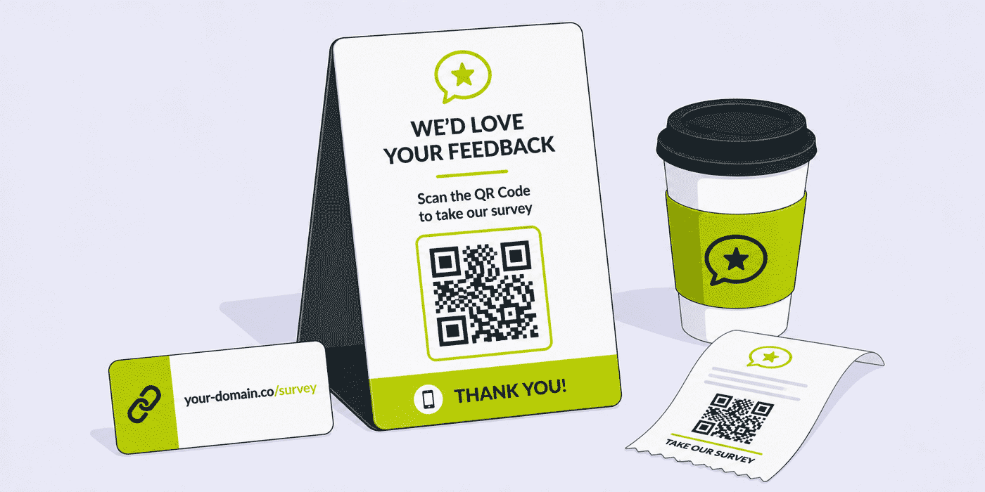
What This Guide Covers
- Why proximity to the experience beats every other factor in feedback collection
- How survey QR Codes work in Cuttly — what every plan includes and what Single adds for print
- Designing the survey a scan leads to: mobile-first steps, question budgets, localized buttons
- Print production: formats, SVG, contrast, sizing, logo placement and the test that saves reprints
- Placement playbooks for restaurants, retail, packaging, events, hotels, gyms, salons and real estate
- The frame around the code: CTA copy, time promises and why the printed short link always goes next to it
- Matching the survey's active period to the lifespan of the printed surface
- Measuring scans vs responses with per-link analytics and the dashboard Survey summary
- Common mistakes that turn printed codes into dead pixels
- A plan-by-plan guide focused on the offline survey workflow
The Proximity Principle
The habit that makes all of this work already exists. Years of QR menus, ticketing, payments and parking have trained customers to treat a code as an ordinary doorway — the scan gesture that once needed explaining now needs none. What has not caught up in most businesses is the feedback side: the same venue whose guests scan a code to order still asks for their opinion through a channel that reaches them days later, if at all. Closing that gap is what this guide is about, and the tools it requires — a survey, a short link, a code and a printer — are fewer than most teams expect.
Every feedback method sits somewhere on a timeline between "during the experience" and "long after it". Email surveys live at the far end: they depend on you having the address, on the message clearing the inbox, and on the recipient reconstructing a memory. Each step loses people, and the people who remain answer from recollection rather than observation.
A QR Code survey lives at the near end. The guest scanning a code on the table is not remembering the visit — they are in it. The customer scanning a receipt code just completed the purchase being asked about. The attendee scanning at the exit walked out of the session thirty seconds ago. Answers collected at this distance are more specific, more accurate and more actionable, because the respondent is describing something in front of them rather than summarizing something behind them.
Proximity also solves the reach problem that quietly limits email surveys: you can only email the people whose addresses you have. A café's walk-in guests, a store's cash customers, an event's badge-scanned crowd, the person who bought your product from a retailer — for all of them, the printed code is not just the best channel. It is often the only one.
How Survey QR Codes Work in Cuttly
In Cuttly, the QR Code is not a separate product you connect to your survey — it is generated from the survey itself, on every plan including Free. Build the survey, generate its code, and the scan opens the survey directly. Because the survey also has a short link with a custom back-half, the code and the link are two doors into the same room, and both are managed from the same dashboard that holds the responses.
What changes between plans is the code's production quality, not its function:
- Free and Starter — QR Codes in PNG, JPG and WEBP formats. Fully functional for screens, documents and simple print jobs.
- Single and above — full customization: colors, dot styles, quality settings and your logo in the center, plus SVG export. SVG is the format print designers ask for, because it scales to any size — a sticker or a wall poster — without losing sharpness.
The customization is not cosmetic vanity. An anonymous black-and-white code asks for a scan on faith; a code carrying your colors and logo tells the person whose survey this is before they commit their camera to it. The techniques in creating a QR Code with a logo apply directly, and the support article on creating a QR Code for your survey shows the exact steps in the survey builder.
What the Code Replaces: The Case Against Paper Comment Cards
Before QR surveys, the tool for on-site feedback was the paper comment card, and comparing the two explains why the switch is worth the modest effort. A paper card needs a pen, a writing surface and a drop box; a code needs the phone already in the guest's hand. Paper answers arrive as a stack to be read, typed up and tallied by someone, eventually; QR responses arrive in the dashboard Survey summary the moment they are submitted, already structured question by question, exportable as PDF, XLS or CSV whenever the review happens. Paper offers no protection for what people write; Cuttly encrypts open answers with 256-bit encryption before storage. And a paper card cannot tell you it was ignored — a code's short link records every open, so you know whether silence means "nobody minded anything" or "nobody saw the card".
The one thing paper had going for it was zero learning curve, and the smartphone era has erased that advantage: scanning a code is now a gesture most customers perform weekly, from menus to parking meters. What remains is a straight trade — the same physical placement, but with structure, security, instant collection and measurable reach on the digital side.
None of this requires abandoning the physical presence that made comment cards work. The table tent, the counter card, the poster — the furniture of on-site feedback stays exactly where it was. Only the mechanism inside it changes.
The Receipt: The Most Underrated Survey Surface
Among all the placements in this guide, the receipt deserves its own section, because it combines properties no other surface has. It is handed to every customer individually, at the exact moment their transaction completes, and it leaves the venue with them — extending the response window from the visit itself to the pocket, the bag and the kitchen counter at home. It costs nothing beyond the ink, because the paper is printing anyway. And it reaches the customers no digital channel can: the walk-ins, the cash payers, the people who will never join a mailing list.
The craft of the receipt placement is compression. There is no room for a poster's framing, so the three-line frame shrinks to its essentials: a five-word invitation ("Tell us about today's visit"), the code, and the short link beneath it. This is where a tight back-half stops being a nicety — cutt.ly/s/visit fits a thermal printer's narrow column where a long address would wrap into illegibility. Receipt codes also sidestep the active-period problem almost entirely: a receipt's persuasive life is measured in days, so even the Free plan's 7-day window covers the realistic response tail, and a Starter or Single window covers it with room to spare.
For businesses that want exactly one QR survey placement to start with, the receipt is the recommendation: individual delivery, perfect timing, zero marginal cost, and a forgiving relationship with every plan limit in the table.
Code or Link First? Reading Your Audience
This guide argues for printing the code and the link together, and that stands. But every surface has a visual hierarchy — one element leads, the other supports — and the right lead depends on who is standing in front of it. Audiences that scan constantly (urban, younger, accustomed to QR menus) treat the code as the door and the link as the caption. Audiences that came to QR later treat a readable address as the trustworthy element and the code as a shortcut for those who want it. A commuter-rail poster and a farmers-market stall can carry the same survey with opposite hierarchies, and both are right.
When you cannot tell which way your audience leans, the per-surface link trick answers the question empirically: give the code and the printed address two different back-halves pointing at the same survey, and the click counts will tell you which door your customers actually use. It is a two-minute setup on any plan, and the answer it produces — scan-first or type-first — then informs every poster, card and insert you print afterward.
Designing the Survey a Scan Leads To
A QR Code survey is a mobile survey, without exception. Nobody scans a poster with a laptop. That single fact should drive every design decision behind the code, and it makes some of Cuttly's survey settings considerably more important in the offline context than they are for email distribution.
Steps, Not Walls
Use the steps layout. One question per screen is how a survey stays comfortable on a phone held in one hand by someone standing at a counter or sitting at a table. Cuttly's transition effects — a quiet fade or slide between steps — keep the movement smooth; save the theatrical options for contexts that earn them. A one-page layout that works fine in an email on desktop becomes a scroll marathon on a 6-inch screen, and scroll marathons get abandoned.
A Tighter Question Budget
The person scanning your code is mid-errand, mid-meal or mid-exit. They are giving you a spare minute, not a scheduled one. Whatever question count works for your email surveys, the QR version should be shorter: three to five questions is the honest ceiling for most physical contexts. Open the survey with a star rating — one tap, instant momentum, and a usable data point even from people who stop there — then spend the remaining questions on the one decision this survey exists to inform. Cuttly's per-plan question limits (5 on Free up to 50 on Team Enterprise) leave plenty of headroom; the discipline is choosing not to use it.
The Start Page Is Your Handshake
Someone who scans a code has less context than someone who clicked a link in your email — no sender name, no subject line, no message around it. The survey's custom Start page carries all of that weight: your logo confirms who is asking, the title says what this is, and the description makes the time promise ("5 questions, about a minute"). On every plan, all three are yours to set. A survey that opens cold, questions-first, from an anonymous code, is a survey that gets closed.
Buttons in the Respondent's Language
Physical placement means you often know the respondent's language better than any email list does — the code is in a specific café, a specific store, a specific city. Set the survey's button language to match: Cuttly offers 16 options on every plan, from English, German, Spanish and French to Arabic, Hindi, Japanese and Chinese. For venues serving mixed audiences — hotels, museums, airports — print two codes side by side, one per language version of the survey, each with its own back-half. The extra survey slot costs a plan tier consideration; the native-language experience pays it back in completion rate.
Print Production: Getting the Code onto Paper Safely
Most failed QR campaigns fail physically, not strategically — a code too small to scan, printed with too little contrast, laminated into glare, or placed behind a bar where no phone camera can reach it. The production checklist is short and worth following every time:
- Size for the scanning distance. A code scanned from a hand's length (receipt, table tent) can be small; a code scanned from across a room (poster, banner) must scale up accordingly. When in doubt, larger — no one has ever failed to scan a code for being too big.
- Keep the contrast high. Dark code on a light background remains the reliable arrangement. Cuttly's color customization (Single and above) lets you brand the code; keep the branding within combinations a camera can still separate. A quiet zone — empty margin around the code — is part of the code, not wasted space.
- Use SVG for professional print runs. Raster formats (PNG, JPG, WEBP) are fine for office printers and screens. For a print shop producing table tents, packaging or large-format posters, the SVG export available from the Single plan is the file to hand over — it scales without a hint of blur.
- Mind the surface. Glossy lamination and curved surfaces (bottles, cups) fight the camera. Matte finishes and flat placements scan faster.
- Test with real phones before the print run. Print one copy at final size, place it where it will live, and scan it with an older phone in the actual lighting conditions. Two minutes of testing versus a reprint of five hundred table tents is not a close call.
The broader craft — placement psychology, error correction, campaign patterns — is covered in QR Code best practices and the complete QR Code generator guide; everything there applies to survey codes without modification.
The Frame Around the Code
A bare QR Code is a question mark. People scan codes at rates that depend almost entirely on the words printed around them, because the words answer the two things everyone silently asks: what happens if I scan this, and how long will it take. The frame that works is three lines:
What: "How was your visit?"
Cost: "5 questions, about a minute."
The typed alternative: cutt.ly/s/visit-feedback
That third line is non-negotiable, and it is where the URL shortener earns its place in this guide's title. Print the survey's short link next to every code, always. It serves the person who prefers typing to scanning, it rescues the campaign if the code is scratched, smudged or badly lit, and — because the back-half is a readable phrase on your domain — it lets everyone who merely glances at the poster learn who is asking and about what. A branded address like your-domain.co/s/feedback does this even harder: the domain your customers already know vouches for the code sitting above it. On surfaces where space is tight, the link can be small; it just has to be there.
Placement Playbooks
Restaurants, Cafés and Bars
The table tent is the classic for a reason: the guest has idle minutes between ordering and eating, and again waiting for the check. A second placement on the receipt catches the completed-visit perspective. Keep the survey to a star rating plus two or three questions, and set the button language to your clientele. Venues already using Cuttly for QR Code menus can run both codes in the same visual style from the same account; the wider playbook is in the restaurant guide and the coffee shop guide.
Retail and Product Packaging
A code on the receipt asks about the store; a code on a packaging insert asks about the product, and reaches customers who bought through retailers you never see. Packaging is the placement where the survey's active period matters most — boxes sit on shelves and in cupboards for months, so use the longest window your plan allows (60 days on Team, 90 on Team Enterprise) and plan the campaign around it. Production details for printing on boxes and inserts are in the product packaging QR guide; store-side patterns in the retail guide.
Events, Conferences and Trade Shows
The exit is the placement: a banner or standee where the crowd flows out, asking about the session or the day while it is still the most recent thing that happened. Codes on badges and printed programs extend the window to the commute home. A 7-day active period covers a post-event survey comfortably, which puts this playbook within reach of any plan. Speakers can add the survey to the final slide as both code and short link. More in the events and conferences guide and the trade show guide.
Hotels and Museums
In-room cards and front-desk placements catch guests during the stay, when problems can still be fixed — which is the operational argument for QR surveys over post-checkout emails: the answer arrives while it is still actionable. Museums place codes at exhibition exits, and mixed international audiences make the dual-language double-code pattern described above particularly effective. See the hotels and hospitality guide and the museum guide.
Gyms, Salons and Local Services
Front desks and waiting areas are natural placements, and the audience is repeat visitors — which means cadence discipline matters more than anywhere else. Rotate surveys rather than leaving one up permanently: a fresh question set each month gives regulars a reason to scan again, where a permanent code becomes wallpaper. Patterns for these businesses are in the gym guide, the beauty salon guide and the hair salon guide.
Real Estate Open Houses
A code by the exit of an open house collects impressions from visitors an agent would otherwise never hear from again — what worked, what put them off, whether the price feels right for the area. Password protection has a niche use here: a code in the window can serve a public teaser survey, while a password-protected version shared at viewings collects franker feedback from serious prospects. Wider agent workflows are in the real estate agents guide.
Matching the Active Period to the Surface
Every printed code is a promise that something is on the other end, and the survey's active period is how long Cuttly keeps that promise. The per-plan windows — 7 days on Free, 15 on Starter, 30 on Single, 60 on Team, 90 on Team Enterprise — are generous for digital distribution but demand real planning for print, because paper outlives campaigns:
- Receipts — hours to days of relevance. Any plan's window covers them.
- Event materials — a week of life. Free's 7 days fits a post-event survey exactly.
- Table tents and posters — weeks on display. Single's 30 days is the comfortable floor; plan the swap date when you plan the print run.
- Packaging and inserts — months on shelves. This is Team and Team Enterprise territory (60–90 days), and even then, align print volumes with the window rather than printing a year's supply against a quarter's survey.
The operational habit that makes this painless: put the survey's end date in the same calendar entry as the print deployment, with a reminder to either replace the printed materials or launch the follow-up survey. A scan that leads nowhere does not just lose one response — it teaches that person that your codes are not worth scanning, and that lesson persists.
Measuring: From Scan to Submitted Answer
The QR survey funnel has two numbers, and Cuttly gives you both from one dashboard. The survey's short link records opens — aggregated and anonymized, consistent with how Cuttly handles analytics across the platform — which for a printed code means scans that reached the survey. The dashboard Survey summary records the responses themselves, viewable question by question and exportable as PDF, XLS or CSV on every plan.
The ratio between the two is the diagnostic. Plenty of opens and few completed responses points at the survey — too long, a cold start page, wrong button language. Few opens against heavy foot traffic points at the physical layer — placement, size, framing copy, or a code that does not scan in that lighting. Two numbers, and you know which half of the system to fix.
Placement attribution comes from the same mechanism described throughout this series: separate short links per surface. The table tent, the receipt and the poster can each carry their own back-half pointing at the same survey — cutt.ly/s/feedback-table, cutt.ly/s/feedback-receipt — and the per-link counts tell you which placement earns its printing costs. The technique is unpacked in how to track QR Code scans and, for the strategy layer, offline attribution with QR Codes and short links.
Reading the Numbers Week by Week
For a standing placement, the useful rhythm is a weekly glance rather than a daily watch. Week one establishes the baseline: how many opens a normal seven days produces for each back-half. Week two is where the first real signals appear — a placement whose opens fall far below its sibling surfaces is misfiring physically, and it is cheaper to move a table tent in week two than to discover the problem in the post-campaign review. From week three onward, the numbers mostly confirm the pattern, and attention shifts to the response side of the funnel: if opens hold steady while completed responses thin out, the audience reachable by that placement is saturating, which is the data's way of saying the rotation date is approaching. None of this requires analysis tooling — two numbers per surface, checked weekly against the calendar entry made at launch, is the entire practice.
Privacy at the Point of Scan
Feedback given in a physical space can feel more exposed than feedback typed at home — the respondent is standing in your venue, sometimes within sight of your staff. Cuttly's privacy features carry extra weight here, and all of them are on every plan: answers to open questions are encrypted with 256-bit encryption before storage, you can attach your own privacy policy link so the survey matches your organization's obligations, and the platform's analytics are aggregated and anonymized by design. Saying so in the Start page description — one line, plainly worded — measurably changes how candidly people answer the open questions, which are usually the answers you wanted most.
A Worked Example: One Café, One Month, One System
To make the moving parts concrete, here is how the pieces of this guide assemble into a single deployment — a neighborhood café running its first feedback cycle. The setup is illustrative, but every step uses features exactly as they exist on the plans named.
The survey. Four questions in steps layout: a star rating on the visit, a multiple choice on what the guest ordered category-wise, a multiple choice on visit frequency, and one open question — "anything we should change?" — whose answers Cuttly encrypts at rest. The Start page carries the café's logo and the promise "4 questions, under a minute." The Finish page thanks guests and mentions the counter jar of loyalty stamps. Button language set to match the neighborhood.
The links. The survey runs on the café's Starter-plan branded domain. Two back-halves point at it: one for the table tents, one for the receipt line. Total setup time for both: about a minute.
The print. Table tents carry the code with the three-line frame; receipts carry the compressed version — invitation, code, short address. Before the print run: one test sheet, scanned with two phones, at the actual corner table with the dim afternoon light. The 15-day Starter window is calendared against the tent swap date.
The human layer. Staff briefed in one team meeting: what the survey asks, the one-line mention at the register, and the rule against fishing for stars.
The close. Day 15: survey ends, responses exported to XLS, open answers read aloud at the next meeting, one change picked. Day 16: the next survey goes up, its Start page opening with "Last month you asked — here's what we did." That sentence is the whole system working: collection, decision, visible change, and a stronger reason to scan than the first tent ever had.
Seasonal and Campaign Codes
Beyond the standing feedback rotation, QR surveys have a second mode: the time-boxed campaign. A holiday menu, a limited product line, a renovation, a new service — anything launched deserves its own short-lived survey asking specifically about it, because "how was the seasonal menu?" collects sharper answers than a general survey with one seasonal question buried inside. The mechanics reward this pattern: a dedicated survey gets a dedicated back-half (cutt.ly/s/winter-menu), its own code on the seasonal materials that are being printed anyway, and an active period that matches the campaign's calendar naturally — which also means campaign surveys fit comfortably inside even the shorter plan windows.
Campaign surveys also solve a quiet problem with permanent placements: novelty. Regulars who tuned out the standing feedback tent will scan the new code on the new menu, because it is visibly about the new thing. Alternating a standing survey with campaign bursts keeps the venue's codes fresh without increasing the total ask on any one guest — and the per-survey summaries in the dashboard keep each campaign's results cleanly separated for the post-campaign review.
Reaching Everyone: Accessibility of the Placement
A feedback channel that only some customers can use produces feedback from only some customers, so two low-cost habits are worth building in. First, the printed short link — already argued for as a fallback — is also the accessible path for anyone who struggles with the scan gesture itself; print it large enough to read at the placement's natural distance, not as fine print. Second, placement height and reach matter: a code at standing eye level on a wall excludes seated guests and wheelchair users, while a code on the table, the counter or the receipt is in everyone's hands by default. The surfaces this guide recommends most — tables, counters, receipts — are, not coincidentally, the most accessible ones.
The Human Layer: Staff Make or Break On-Site Surveys
A printed code is passive. The single cheapest way to multiply its response rate is a sentence spoken by staff at the natural moment: "There's a one-minute survey on the receipt if you'd like to tell us how it went." The verbal mention converts the code from decoration into an invitation, adds the social weight of a person asking, and costs nothing but a line in the training notes. Teams that do this consistently see the difference in the link's open counts within the first week — and because each placement can carry its own back-half, you can even verify it, by comparing a location where staff mention the survey against one where they do not.
Two guardrails keep the human layer honest. First, the mention must stay an invitation, never a pitch for a good score — coaching customers toward five stars poisons the very data you are collecting, and customers can tell. Second, staff should know what the survey asks and where the results go, because "what's it about?" is the most common follow-up question and "I don't know" undoes the trust the branded code just built. A two-minute walkthrough of the survey at a team meeting covers both.
Closing the Loop: From Responses to Changes
Feedback collection earns its place only if the answers change something, and the QR workflow has a built-in rhythm for that. Each survey's active period gives it a defined end; the end is the review moment. Export the responses — CSV for analysis, XLS for the manager's spreadsheet, PDF for the report that goes upward — read the open answers together, pick the one change the results justify, and make it before the next survey goes up.
Then tell people. The venues that get the most from on-site surveys close the loop publicly: a small sign, a line on the next table tent — "You asked for oat milk. It's here." — or a sentence on the next survey's Start page naming what the last round changed. This is the strongest response-rate lever in the entire guide, stronger than design, placement or copy, because it answers the question every potential respondent silently asks: does anyone actually read these? Show that the answer is yes, and the next code earns scans the previous one had to beg for.
The rotation habit ties it together. Survey ends, results reviewed, change made, change announced, next survey up — a monthly cycle for most venues, quarterly for slower businesses. Cuttly's per-plan survey counts (3 on Starter, 5 on Single, 20 on Team) are sized for exactly this cadence, and the dashboard keeps the closed surveys' summaries available for comparison, so you can watch the star-rating question drift upward across cycles as the changes accumulate.
From One Code to a System: Multi-Location Feedback
Everything above scales from one placement to a network of them, and the mechanics stay the same — only the naming discipline grows. A business with several locations gives each site its own short link to the shared survey: cutt.ly/s/feedback-north, cutt.ly/s/feedback-airport, cutt.ly/s/feedback-oldtown. The survey builds once; the per-link analytics split the results by site automatically, and the location whose link goes quiet is the location whose placement, staff mention or foot traffic needs a look. Where locations differ enough to need different questions — or different languages — separate surveys per site take over, which is where the Team tier's 20-survey capacity and 2,000-response limits become the operating room rather than headroom.
At this scale the account structure matters as much as the links. Team's multi-user access with role-based permissions means the print designer, the location managers and the analyst reading quarterly exports work in one account without sharing one login — the designer touches QR files, the managers watch their own links, the analyst pulls the CSVs. One system, many hands, no forwarded passwords.
The Pre-Launch Checklist
Everything in this guide compresses into a sequence you can run in under an hour for a single-location deployment. Before any code reaches a printer:
- 1. The decision is named. You can state, in one sentence, what this survey's results will change.
- 2. The survey is mobile-shaped. Steps layout, star-rating opener, five questions or fewer, one open question at most.
- 3. The Start page carries logo, purpose and time promise. The Finish page thanks specifically.
- 4. Button language matches the placement's audience. Dual-language venues have two survey versions ready.
- 5. Every surface has its own back-half. Named so the analytics read like a report:
-table,-receipt,-poster. - 6. The active period is calendared — end date, review meeting and print swap in the same entry.
- 7. The right file went to print. SVG for professional runs (Single and above), raster only for office printing at modest sizes.
- 8. The frame is complete. What, cost, and the printed short link — legible at the placement's real distance.
- 9. One physical test passed. Final size, final spot, final lighting, an older phone.
- 10. Staff know the one-line mention — and the rule against coaching scores.
Ten items, none of them difficult, and together they cover every failure mode described in this guide. Teams that run the checklist on the first deployment tend to internalize it by the second — at which point QR surveys stop being a project and become what they should be: a standing, low-effort channel through which the people you serve tell you how to serve them better.
Common Mistakes That Turn Codes into Dead Pixels
- The bare code. No framing copy, no time promise, no printed link. Scans go to the codes that explain themselves.
- Desktop-shaped surveys. A one-page, fifteen-question format behind a code guarantees abandonment on phones. Steps, star-rating opener, five questions.
- The immortal poster. Print outliving the survey's active period. Calendar the end date with the deployment.
- Style over scannability. Low-contrast brand colors, missing quiet zone, glossy lamination. Customize within what cameras can read, and test at final size.
- One code for every placement. Costs nothing to split back-halves per surface; without it, you will never know whether the table tent or the receipt did the work.
- Raster files at poster scale. A PNG stretched to banner size scans poorly. From Single upward, hand your print shop the SVG.
- The permanent survey. Same questions up for a year in a venue full of regulars. Rotate monthly; give repeat visitors a reason to scan twice.
Cuttly Plan Guide for QR Code Surveys
The Free plan ($0) generates a working survey QR Code in PNG, JPG or WEBP — enough to run a genuine pilot: one survey, five questions, ten responses, a 7-day window. That profile fits a single post-event survey or a proof-of-concept at one location. Registration is required; no credit card is needed.
The Starter plan ($12/month) brings the branded custom domain, so the printed link beside your code reads your-domain.co/s/feedback, plus 3 surveys, 30 responses each and a 15-day window — a small venue's monthly feedback rotation, under its own name.
The Single plan ($25/month) is where print work becomes professional: full QR customization — colors, dot styles, logo, quality — and SVG export for the print shop, alongside 5 surveys, 100 responses each and a 30-day window. For a business putting branded codes on table tents, counters or window displays, this is the practical starting tier.
The Team plan ($99/month) scales to programs: 20 surveys with 2,000 responses each and 60-day windows cover multi-location rotations and packaging campaigns, while multi-user access with role-based permissions lets the marketing team, the designers handling print files and the analysts reading exports share one account.
The Team Enterprise plan ($149/month) serves large organizations running offline feedback at scale — 50 surveys, 5,000 responses each, 90-day active periods — where packaging runs, national campaigns and many-location deployments need the platform's highest limits.
The fastest way to know whether QR surveys work for your space is to run one: create a free Cuttly account, build a five-question survey, print its code on a single sheet and put it where your customers already are. Registration required; free plan available with no credit card needed.
Frequently Asked Questions
Can I generate a QR Code for a survey on the Cuttly free plan?
Yes. Every plan, including Free, generates a QR Code for your survey — on Free and Starter in PNG, JPG and WEBP formats. From the Single plan upward, the code becomes fully customizable (colors, dot styles, quality, your logo) and adds SVG export for print production.
Where should I place a survey QR Code to get the most responses?
Where the experience is fresh and the person has a phone in hand and a spare minute: table tents, counters, receipts, event exits, packaging inserts, waiting areas and posters. Placement beats design — a plain code in the right spot outperforms a beautiful code in the wrong one.
How long does a survey behind a printed QR Code stay active?
Up to 7 days on Free, 15 on Starter, 30 on Single, 60 on Team and 90 on Team Enterprise. Match the window to the print surface: receipts need days, posters need weeks, packaging needs the longest window your plan allows — and calendar the end date alongside the print deployment.
Can I measure how many people scanned the code versus how many completed the survey?
Yes. The survey's short link records opens through Cuttly's aggregated, anonymized analytics, and the dashboard Survey summary records completed responses. The gap between the two tells you whether to fix the physical layer (placement, size, framing) or the survey itself (length, start page, language).
Should I print the short link next to the QR Code?
Always. The code serves scanners; the readable address — cutt.ly/s/visit-feedback or your-domain.co/s/feedback on a branded domain — serves typists, survives damaged codes, and tells everyone at a glance who is asking. Custom back-halves are available on every plan.
Do I need a separate QR tool alongside my survey tool?
Not with Cuttly. The survey, its short link, its QR Code, its click analytics and its responses are one object in one account — nothing to stitch together, one login, one export when the survey closes.
Can I run the same printed survey in two languages?
Print two codes side by side, one per language version of the survey, each with matching button language (16 available on every plan) and its own back-half. Mixed-audience venues like hotels and museums see the completion-rate benefit immediately, and the separate links keep each audience's results distinct.
- SURVEYS
- URL Shortener Tool →
- QR Code Generator →
- Link in Bio Builder →
- This Series
- Online Surveys — The Pillar Guide
- Related Guides
- QR Code Best Practices
- Tracking QR Code Scans
- QR Codes on Packaging
- Offline Attribution
- Similar Verticals
- Restaurants
- Retail
- Hotels & Hospitality
- Events & Conferences
- Encyclopedia
- Dynamic QR Codes
- Branded Links
- Verticals Hub
- URL Shortener for Every Industry →
- Start Here
- Create Free Account
- Plans & Pricing
URL Shortener
Cuttly simplifies link management by offering a user-friendly URL shortener that includes branded short links. Boost your brand’s growth with short, memorable, and engaging links, while seamlessly managing and tracking your links using Cuttly's versatile platform. Generate branded short links, create customizable QR codes, build link-in-bio pages, and run interactive surveys—all in one place.
Cuttly More Than Just a URL Shortener
Cuttly is a comprehensive, ever-evolving platform for link shortening that combines innovation and user-friendliness to deliver a seamless experience in managing and shortening URLs.


