Action Page vs Landing Page When a URL Shortener Is All You Need
Somewhere between "we need a page for this" and the campaign going live sits a decision most teams never make consciously: how much page does this moment actually need? The reflex answer is always "a landing page" - brief the designer, block the developer, wait a week - and for some campaigns that reflex is right. For many others, the week and the build buy nothing the campaign uses: the visitor arrives from an ad or a QR code already knowing why, faces one decision, and needed three sentences and a button, not seven sections and a testimonial wall.
This guide is the missing decision, made explicit. It compares the Cuttly Action Page - the one-button page living directly under a URL Shortener address - against the full landing page built on your site or builder, through five tests any campaign can be run through in two minutes. It is honest in both directions: several sections of this guide argue for the landing page, because a framework that always picks its author's product is a brochure, not a framework. It closes the Action Pages arc begun in the pillar guide and continued in the launch guide.
What This Guide Covers
- What each format is - and the one structural difference everything else follows from
- The five tests: Decision, Explanation, Tempo, Ownership, Measurement
- Where the Action Page wins: campaign traffic, physical entry points, speed and live edits
- Where the landing page wins: cold traffic, forms, SEO assets, multi-audience pages - stated plainly
- What an Action Page deliberately doesn't do, and the tools that cover those jobs
- The combination patterns: front door, checkout bridge, and the link layer before both
- Six campaign scenarios walked through the tests
- The same campaign built both ways - what actually changes
- Migration in both directions as campaigns mature or simplify
- Common mistakes on each side of the line
- A plan guide for teams adding Action Pages beside an existing site
Two Formats, One Structural Difference
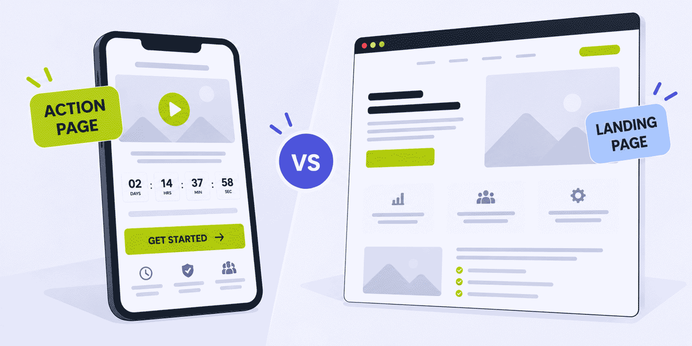
Strip the marketing language and the two formats reduce cleanly. An Action Page is a standalone call-to-action page that exists directly under a short link - cutt.ly/c/offer, or your-domain.co/c/offer on a branded domain - carrying a title, a description, a logo, a background of your choosing, an optional YouTube or Vimeo video, an optional countdown, and exactly one CTA button leading to one destination. Nothing is hosted, deployed or maintained; the page is created and edited in the Cuttly dashboard and lives as long as you keep it, within a fixed inventory of 3 pages on Single, 10 on Team, 20 on Team Enterprise.
A landing page is a full web page on infrastructure you run - your CMS, your site builder, your framework - with everything that implies: unlimited sections, embedded forms, custom scripts, integrations, and the design freedom of a blank canvas, purchased with the build time, the maintenance and the stakeholders of a blank canvas.
Every practical difference between them follows from one structural fact: the Action Page has decided its structure already, and the landing page hasn't. The Action Page's constraint - one button, a handful of elements - is not a missing feature; it is the feature. It makes the page buildable in minutes, editable in seconds, impossible to clutter, and measurable in one honest number (the CTR between visits and button taps). The landing page's freedom is equally real: it can hold whatever the persuasion requires, and it answers to no format's opinion about what that should be. The question is never which format is better; it is which constraint your campaign benefits from.
The Comparison at a Glance
| Dimension | Action Page | Landing Page |
|---|---|---|
| Lives at | cutt.ly/c/alias or your-domain.co/c/alias | Your site or builder |
| Structure | Fixed: title, description, media, countdown, one CTA | Open: any sections, any elements |
| Build time | Minutes, in the dashboard | Days to weeks, through your process |
| Edits | Live, by the campaign owner | Through whoever owns the site |
| Forms on page | No - button leads to where the form lives | Yes, embedded and integrated |
| CTAs | Exactly one | As many as designed |
| Countdown with real deadline enforcement | Built in (hide-at-zero option) | Custom-built if needed |
| Hosting and maintenance | None | Yours |
| Measurement | Visits, clicks by day, referrals, CTR - in the Cuttly dashboard | Whatever you instrument |
| SEO role | Campaign surface, reached by distribution | Durable, rankable asset |
| Best audience | Warm, arriving with context | Cold, needing the full case |
| Availability | From Cuttly Single: 3 / 10 / 20 pages | Wherever you build it |
The table's shape tells the story before the tests do: nearly every row trades speed and focus against room and control. Neither column dominates - which is exactly why the choice deserves two minutes of deliberate thought per campaign rather than a standing reflex in either direction.
The Five Tests
Run any planned page through these in order. The earlier a test gives a clear answer, the less the later ones matter.
1. The Decision Test
How many decisions does the visitor face on this page? One - sign up, buy this, book now, download, RSVP - and the Action Page's shape fits exactly: its single button is the decision, rendered. Several decisions - choose a plan, pick a product, compare options, or "learn more" alongside "buy" - and the one-button format would force choices it cannot hold; that is landing page territory, or a Link in Bio page when the "decisions" are really a directory of destinations. Most campaign pages fail this test in the revealing direction: they carry three CTAs out of stakeholder diplomacy, not visitor need, and would convert better as one page per decision.
The test sharpens when applied to real briefs. "Promote the sale" is not yet a decision count - the sale's page might be one button ("Shop the sale") or a plural storefront, depending on whether the campaign sends visitors to browse or to claim. "Announce the feature" splits the same way: one decision if the announcement's job is "try it," several if it must also route existing users, prospects and press. The habit worth building is naming the visitor's decision in a single imperative sentence before choosing anything; campaigns that resist the sentence are telling you their format, and campaigns that produce two sentences are telling you they are two campaigns.
2. The Explanation Test
How much explaining stands between the visitor's arrival and a confident yes? The Action Page's ceiling is honest: a title, a few sentences, one video. That ceiling comfortably covers visitors who arrive with context - they clicked the ad that named the offer, scanned the QR on the poster that framed it, opened the email that made the case. It cannot cover cold traffic meeting a complex product for the first time: no three sentences carry an unfamiliar B2B platform's case, and pretending otherwise produces a beautiful page with a terrible CTR. The test in practice: write the description. If three sentences and the video truly close the gap between arrival and action, the format fits. If you are compressing seven arguments into three sentences, the campaign needs the landing page's room.
3. The Tempo Test
How fast must this page appear, and how often will it change? Campaign reality has a tempo problem: the moment is Tuesday, the developer's sprint ends Friday week. The Action Page's tempo is its clearest win - built in minutes by whoever runs the campaign, edited live mid-flight when day two's numbers argue for different copy, deleted when the moment passes. Pages that must exist today, change during the campaign, or exist for a weekend fit this tempo. Pages that will stand for a year, change quarterly through a review process, and justify their build time across thousands of visits fit the landing page's tempo instead - the build cost amortizes, and the review process is a feature at that lifespan, not a delay.
4. The Ownership Test
Who will create, edit and retire this page - and what do they control? If the answer is "the marketing side, without engineering," the Action Page removes the dependency entirely: dashboard in, dashboard out, no ticket. If the page needs what only your own infrastructure provides - embedded forms feeding your CRM, custom scripts, pixel-level design control, your analytics stack running on-page - then the page belongs where those capabilities live, and the engineering dependency is simply the price of them. This test also catches the quiet failure mode of borrowed infrastructure: a campaign page on the corporate CMS inherits the corporate release calendar, and many "we'll just add a page to the site" plans die in exactly that inheritance.
5. The Measurement Test
What must this page prove, and to whom? The Action Page measures like a campaign: visits, clicks by day, referrals, and CTR - page visits against button taps - with 180 days of retention on Single and a year on Team tiers, all aggregated and anonymized, all in the same dashboard as the links pointing at it. For "did this campaign convert its traffic," that is the whole requirement, met. For funnel analysis across steps, session behavior, or experimentation frameworks wired to your data warehouse, the landing page carries your instrumentation because it can carry anything. The wider measurement thinking lives in the link analytics guide.
A Note on Testing Between the Formats
The tests are judgments, and judgments can be checked. When a campaign truly straddles the line, the link layer offers a referee: Cuttly's link rotation on the Single plan and above can split a single distributed address 50/50 between two destinations - the Action Page version and the landing page version of the same campaign - and the downstream numbers (the page's CTR on one side, your site's conversion on the other) turn the format debate into an afternoon's data. Few campaigns need this; the option's existence mostly serves to end meetings, since "we can test it" defuses the reflex on both sides.
Where the Action Page Wins
- Warm campaign traffic. Social, email, ads and messaging deliver visitors who already know why they came; the page's job is confirmation and one tap, which is the format's exact shape.
- Physical entry points. QR codes on posters, packaging, table tents and event materials - where the printed frame did the explaining and the page finishes the motion. The page's own customizable QR (from Single, with SVG for print) closes this loop in one product.
- Moments with a clock. Launches, offers and deadlines get the countdown - with the hide-at-zero option retiring the button when the offer truly ends - which no static page enforces for you.
- The spoken and typed address.
your-domain.co/c/offersurvives podcasts, radio, and business cards; a landing page's path rarely does. Campaigns whose address travels by voice lean Action Page for the address alone. - Teams without a site - or without access to theirs. Creators, local businesses and side projects get a professional page with zero hosting; marketing teams inside slow organizations get one without a ticket.
- Everything the launch guide covers. The one-address lifecycle - teaser, switch, close - is this format's home game, documented end to end in the launch countdown guide.
Where the Landing Page Wins - Stated Plainly
A decision framework earns trust by conceding real territory, so here is the landing page's, without hedging:
- Cold traffic that needs convincing. When the page must build the case from zero - unfamiliar product, considered purchase, skeptical audience - persuasion needs sections: proof, objections, comparisons, testimonials. The Explanation Test's ceiling is real, and campaigns above it belong on the long page.
- Forms on the page itself. An Action Page's button leads to where the form lives; it does not host one. Multi-field lead capture, gated content exchanges and applications need the landing page's embedded forms wired to your systems.
- SEO assets. A page meant to rank, accumulate authority and answer searches for years is a durable property of your own site. Action Pages are campaign surfaces reached through the links you distribute - build your evergreen search pages on your domain's own real estate.
- SEO's constructive corollary: the two roles reinforce each other rather than compete - the durable page ranks and educates; the Action Pages skinning its campaigns distribute and convert; and the campaign traffic the skins accumulate never dilutes the standing page's focus. Teams that stop asking pages to do both jobs usually improve at both.
- Multi-audience and multi-CTA pages. Pricing pages, comparison pages, pages serving both buyers and existing users - plural decisions, plural sections, the Decision Test answered in the landing page's favor.
- Custom everything. Bespoke design systems, interactive elements, calculators, embedded experiences, your experimentation stack. Infrastructure you control exists precisely for requirements a format cannot anticipate.
And one adjacent concession inside Cuttly's own toolset: when the goal is collecting structured answers rather than driving one action, neither page format is the tool - Cuttly Surveys is, with its own short link, question types and encrypted open answers, in the same account.
The Economics Nobody Briefs: Cost of the Page vs Cost of the Wait
Format debates fixate on the page's visible costs - design hours, builder subscriptions, developer time - and skip the cost that usually dwarfs them: the campaign days spent waiting. A moment-driven campaign loses value daily before its page exists; the partnership announcement that goes live a week after the partner's, the seasonal offer whose page ships mid-season, the reactive campaign that stopped being reactive in the queue. Measured against the moment, the landing page's build time is not a production line item but a tax on relevance - sometimes worth paying, when the Explanation Test demands the room, and pure loss when it doesn't.
The Action Page's economics run the other way and are worth stating without disguise: it is a plan feature, not a free tool - from Single at $25/month - and its inventory is finite. What the price buys is the collapse of the waiting cost to zero across every campaign the plan's pages carry, plus the retirement of the maintenance line entirely: no hosting, no updates, no page rot, no "who built this and does it still work" audit two years on. For teams running several campaigns a quarter, the arithmetic tends to settle itself; for a team running one campaign a year on an existing site with idle capacity, it may not, and the framework's honesty cuts that way too.
The maintenance asymmetry deserves its own sentence, because it compounds silently. Every landing page ever shipped joins a portfolio someone must keep coherent - links checked, offers current, brands aligned - and dead campaign pages on live sites are among the most common trust leaks a business accumulates. The Action Page's fixed inventory forces the hygiene the open format only recommends: with 3, 10 or 20 slots, retiring finished pages is not a virtue but a necessity, and the portfolio stays exactly as large as the campaigns that are actually running.
The Combination Patterns
The choice is rarely exclusive, and the strongest operations run both formats in sequence. Three patterns cover most of it:
The Front Door
The Action Page as the campaign's entry, the landing page as the destination. The campaign's every channel carries one short, speakable, printable address; the page frames the moment in three sentences and a clock; the button hands warm visitors to the landing page or checkout where the deeper work happens. This buys the campaign the Action Page's tempo and address without giving up the landing page's depth - and it puts a measured checkpoint at the funnel's top, since the front door's CTR reads message-to-audience match before your site's analytics ever see the visitor. On Single, the pattern works when the destination shares your domain; Team's any-URL rule frees it entirely.
The Campaign Skin
The landing page as the durable asset, Action Pages as its seasonal skins. The evergreen product page stands and ranks year-round; each campaign - the holiday offer, the partner push, the drop - gets its own Action Page with its own address, copy, countdown and close, buttoned to the standing page. Campaigns come and go through the fixed inventory's rhythm (build, run, export, delete) while the SEO asset accumulates undisturbed. This is also the honest division of labor between the formats' measurement: the skins read campaigns, the site reads the year.
The Link Layer Underneath Both
Whichever format wins, the campaign's links precede it: channel back-halves, branded domains, QR codes and the attribution they carry apply identically whether they point at a /c/ page or your site. That layer - the argument that the link infrastructure comes before the landing decision - is made in full in the link layer before the landing page, and nothing in this guide's choice changes it.
The Mobile Reality Both Formats Answer To
Whichever format wins, the visitor holding it is overwhelmingly on a phone - campaign traffic from social, messaging, email and every QR code arrives on a small screen, often mid-motion - and the formats meet that reality differently. The Action Page cannot fail mobile: its fixed anatomy renders as one focused screen by construction, and there is no layout decision available that could bury the button below a scroll of sections. The landing page can be excellent on mobile and routinely isn't, because every added section is another chance for the desktop design review to approve something a thumb will abandon. This is not an argument that decides the choice - the landing page's room is worth its risks when the tests call for it - but it reweights the borderline cases: when a campaign could go either way, the format that cannot be assembled wrong on the screen it will actually be seen on is the safer default.
Trust Signals at the Moment of Decision
Both formats face the same visitor question at the same instant - is this legitimate? - and answer it with different materials. The landing page answers with your full site around the offer: navigation, footer, the accumulated familiarity of your web presence. The Action Page answers with concentrated signals: the branded domain in the address bar (your-domain.co/c/offer from a Starter-carried domain, the case made in the branded domains guide), your logo and visual identity filling the page, and your own privacy and terms links attached - an option on every Action Page, and the material one when the button's destination asks for anything. Neither answer is inherently stronger; they fail differently. A landing page on a neglected site inherits the neglect; an Action Page on a generic address with no logo is a legitimacy question mark. The craft, either way, is making sure the format's trust materials are actually deployed - which for the Action Page is a two-minute checklist, and for the landing page is the state of your whole site.
Nine Scenarios Through the Tests
Frameworks prove themselves on cases, so here is a spread of common campaigns run through the tests - including the borderline ones and the ones that need neither format, because a framework that only produces its favorite answer isn't one.
Webinar Signup - Action Page
One decision (register), arriving warm from email and social, live next week, owned by marketing, measured as a campaign. Five tests, five Action Page answers; the button points at the registration platform (Team's any-URL when the platform is third-party), and the countdown targets the date.
Gated Industry Report - Landing Page
The exchange is content for form data - company, role, email - and the form is the page's entire mechanism. The Action Page cannot host it; the landing page with the embedded form wired to the CRM is the format, with a regular short link fronting it for the campaign's channels.
Restaurant's Seasonal Menu - Action Page
One decision (book a table), traffic from a window QR and local social, live tonight, owned by the owner, changing when the menu does. The format was built for exactly this tempo, per the restaurants guide - and on Single, a booking system on the restaurant's own domain keeps the destination rule comfortable.
B2B Platform's Core Product Page - Landing Page
Cold and considered: visitors compare, object, and need the case built section by section, and the page must rank for the category's searches for years. Explanation Test and SEO both point one way. The campaigns pointing at it, meanwhile, run Action Page front doors per the combination patterns.
Nonprofit's Matching-Deadline Appeal - Action Page
One decision (give), a real deadline (the match ends Friday - hide-at-zero armed), warm traffic from the supporter list, and an address that must survive being read aloud at events. The nonprofits guide carries the surrounding practice; the donation processor as destination is Team-tier any-URL territory.
App with a Free/Pro Comparison - Landing Page, Fronted
The comparison is the persuasion - two columns, feature rows, plural decisions - so the page is a landing page by the Decision Test alone. But its install campaigns run the front-door pattern: per-channel Action Pages with one "Get the app" button each, reading each channel's CTR separately before the store listing swallows the trail.
Job Opening Push - Action Page
One decision (apply), a real closing date, traffic from the team's own networks where the address gets pasted into chats and spoken in conversations, and the application form living on the careers system the button points to. The countdown does honest work here - application deadlines are the rare deadline everyone believes - and the per-channel links read which network actually delivers candidates, a finding the recruitment guide builds on.
Podcast Episode Push - Action Page, Barely
The borderline case worth showing: an episode push could be a bare short link straight to the player - and often should be. The Action Page earns its slot only when the moment carries more than the link: a milestone episode with the trailer in the video slot, a guest whose audience needs one paragraph of framing, a limited series with a countdown to the finale. The test inside the test: if the page would add nothing the player's own page doesn't show, skip the page and spend the slot elsewhere. Formats are tools, not defaults - the podcasters guide covers when the bare link wins.
Annual Report for Stakeholders - Neither; a Link and a PDF
Included as the framework's boundary marker: some campaigns need no page at all. A report distributed to a known list is a document and a short link with a readable back-half; building either page format around it adds a step between the reader and the thing. The five tests assume a page is needed - the zeroth test, always, is whether it is.
The Decision, as a Flow
The tests compress into a sequence you can run in the campaign kickoff's margins. Does this moment need a page at all, or just a link to the thing itself? If a page: is its mechanism a form or structured answers - then it is a landing page with an embedded form, or a Survey. If not: does the visitor face one decision or several - several sends it to the landing page (or Link in Bio when it's really a directory). One decision: can three sentences and a video close the gap for the traffic that's actually coming - cold and complex sends it long; warm sends it on. Still standing: does the campaign's tempo, ownership and measurement fit the dashboard or the site? By this point the answer has usually declared itself twice over - and when it truly hasn't, the front-door pattern runs both formats in sequence and lets the CTR referee.
The Same Campaign, Built Both Ways
To make the trade concrete, take one campaign - a design studio opening its autumn workshop cohort, twenty seats, warm audience - and build it twice.
As a landing page: a brief to the designer, a template chosen, sections drafted - hero, curriculum, instructor bio, testimonials, FAQ, form. A build measured in days where the site cooperates and weeks where it doesn't; edits routed through whoever owns the CMS; measurement assembled from the site's analytics filtered to the page. The result is fuller: the curriculum section answers questions the short format would have sent to email, and the embedded application form captures portfolio links the button pattern cannot.
As an Action Page: forty minutes in the dashboard - studio logo, workshop photo background, "Autumn Cohort. Twenty seats. Applications close Sept 30," three sentences, the instructor's ninety-second video, countdown to the deadline with hide-at-zero armed, button "Apply now" pointing at the application form on the studio's domain. Channel links for newsletter and social; the QR on the studio's counter card. Edits, when the first week's questions reveal the description's gap, take a minute.
Which was right? The tests say: warm audience, one decision, hard deadline, marketing-owned, campaign-measured - the Action Page, with the application form (the one thing the format cannot hold) living at the button's destination, exactly as the front-door pattern prescribes. The landing page's extra fullness served questions this audience wasn't asking. A colder audience, a pricier program, a page meant to recruit year-round - and the same tests flip the same campaign the other way. That is the framework working: not a winner, a fit.
The measurable coda: the studio's page reported its campaign in three numbers - visits against the two channel links' split, the CTR into the application form, and the countdown's close freezing the record at deadline. When next spring's cohort opens, those numbers are the brief: which channel led, what the CTR said about the copy, whether twenty seats' worth of applications arrived with room to spare. The landing page version would have produced richer session data and poorer campaign clarity; the format's small instrument panel is, for this job, the sharper one.
What the Action Page Deliberately Isn't
Formats clarify themselves at their edges, so here is the map of neighboring jobs and their actual tools - all, as it happens, in the same account. Needing many links standing together is not an Action Page stretched thin; it is the Link in Bio page, built for the directory job. Needing answers - feedback, applications-as-questions, research - is Surveys, with question types the button format cannot express. Needing just the redirect, with no framing at all, is the regular short link, and reaching for a page where a link suffices adds friction in the name of polish. And needing a website - the durable, multi-page, searchable presence - is a website; no one-page format substitutes for one, and this guide has not pretended otherwise. The Action Page's territory is precisely what remains: one moment, one decision, one button, framed and clocked and measured, at an address that travels.
Adopting the Format Inside a Team That Has a Site
The organizations for whom this guide's question is live already have landing pages, a process, and opinions - so the format's adoption path matters as much as its merits. The pattern that works is the pilot at the process's pain point: pick the campaign type that most often misses its moment in the current pipeline (the reactive push, the small partner co-promo, the regional offer too minor for the sprint) and run its next instance as an Action Page, tests documented, CTR read at close. The comparison this produces - moment met versus moments historically missed, at a build cost of one afternoon - is the argument no slide deck makes as well. From there the division of labor settles along this guide's lines: the site keeps the durable and the deep, the dashboard takes the fast and the focused, and the front-door pattern stitches them where campaigns need both. On the Team plan, role-based access maps the division onto the account itself - campaign owners build pages, without anyone touching the site's keys.
The Series, Closed
This guide ends an eight-part arc, and the arc's shape is worth one paragraph because it is the platform's shape too. The surveys guides covered collecting answers - open programs, offline entry points, events and closed rooms. The Action Pages guides covered driving actions - the format, the launch lifecycle, and now the boundary with the pages you already build. Underneath all eight runs the same layer: short links with back-halves that attribute, branded domains that vouch, QR codes that bridge the physical, and analytics - aggregated and anonymized throughout - that read it all from one dashboard. Ask, act, measure: one account, and the campaign chooses its instruments per moment rather than per subscription.
A Note on Landing Page Tools
This guide has deliberately treated "the landing page" as wherever yours live - a CMS, a site builder, a framework, an in-house stack - because the comparison holds regardless of the vendor behind the long format. Cuttly is not a landing page builder and does not compete with yours; the Action Page competes with the reflex of briefing one for campaigns that never needed the room. Whatever builds your durable pages, the division of labor in this guide - and the link layer underneath both formats - plugs into it unchanged, which is also why the combination patterns assume your existing tools rather than replacing them.
Migrating in Both Directions
Campaigns mature and simplify, and the formats hand off cleanly in both directions. Upward: the offer that started as an Action Page proves itself, earns a durable home, and graduates to a landing page - at which point the Action Page's address, already distributed everywhere, gets its button pointed at the new page (the front-door pattern arrived at backward), or the page is closed and its slot returned. Downward: the landing page whose analytics show visitors using exactly one of its five sections is a one-decision page wearing four sections of costume; its next campaign runs as an Action Page, and the CTR comparison settles the argument empirically. Neither migration strands anything, because the link layer underneath - the branded domain, the distributed addresses - survives both.
Revisiting the Choice as Campaigns Repeat
The choice is per-campaign, but campaigns recur, and the second running of any campaign type deserves a one-line review of the first's format call. The evidence is already filed: the Action Page's exported CTR and channel split, or the landing page's conversion read, against what the campaign was meant to do. Most reviews confirm the call and take ten seconds; the valuable ones are the surprises - the "simple" campaign whose page fielded questions the description never answered (next time, the long format or a better three sentences), or the built-out page whose visitors used one section and left (next time, the button). A team that runs this review for two quarters ends up with house rules - "partner co-promos: Action Page; gated research: landing page with the form" - and the framework retires into habit, which is where frameworks belong.
Common Mistakes on Both Sides
- The reflex landing page. A week of build for a weekend campaign a one-button page carried better. Run the Tempo Test before the brief.
- The overloaded Action Page. Three offers compressed into one button's description because the format was chosen before the Decision Test. One decision per page - or the other format.
- Cold traffic on the short format. An unfamiliar product's whole case in three sentences, and a CTR that reports the mismatch. The Explanation Test exists to prevent this.
- An SEO strategy on campaign surfaces. Evergreen search intent belongs on your site's durable pages; Action Pages are reached through distribution, not rankings.
- Forms forced through workarounds. If the page's mechanism is a form, it is a landing page (or a Survey, when the goal is answers). The button-to-form front door exists for the borderline cases.
- Two formats, no link layer. Either page without channel back-halves and a branded address is a destination without attribution. The layer comes first, whichever page wins.
- The immortal campaign page. On either side: the expired offer still live on the site, or a finished Action Page squatting in the fixed inventory. Deadlines kept, exports filed, pages retired.
The Choice on One Page
Zeroth: does the moment need a page at all? Then the mechanism: forms and answers go long or to Surveys; directories go to Link in Bio. Then the five tests in order - one decision or several; three sentences or seven arguments; Tuesday's tempo or the quarter's; the dashboard's ownership or the site's; a campaign's numbers or the funnel's instrumentation. Warm, singular, urgent, marketing-owned and campaign-measured is the Action Page's exact silhouette; cold, plural, durable, engineered and deeply instrumented is the landing page's. The borderline runs the front door and lets the CTR referee; the calendar runs the skins; and underneath every outcome, the link layer - branded domain, channel back-halves, the address that travels - is built first and survives whichever page wins.
Cuttly Plan Guide for Teams Weighing the Formats
The Free plan ($0) and Starter plan ($12/month) do not include Action Pages, but they carry the layer this guide puts under both formats - short links, QR codes, channel attribution, and on Starter the branded domain. A team still deciding can build the link layer now and add the page format when a campaign calls for it. Registration is required; no credit card is needed.
The Single plan ($25/month) opens the format: 3 Action Pages, the full editing surface, customizable QR with SVG, and 180 days of analytics with CTR. Its same-domain rule on CTA destination edits suits businesses whose buttons point at their own sites - which describes most front-door patterns aimed at your own landing pages and forms.
The Team plan ($99/month) removes the destination boundary - any URL, the rule third-party ticketing, stores and processors need - with 10 pages for a real campaign calendar, a year of analytics for season-over-season reads, and role-based multi-user access for the teams running both formats side by side.
The Team Enterprise plan ($149/month) extends the operation to 20 pages at the platform's highest limits, for multi-brand calendars running the campaign-skin pattern at scale.
The next campaign on your calendar is the cheapest way to run the tests for real: create a Cuttly account, walk the five questions, and build whichever page they pick. Registration required; free plan available with no credit card needed.
Frequently Asked Questions
What is the difference between an Action Page and a landing page?
Structure, decided versus open. An Action Page lives under a short link with a fixed anatomy - title, description, media, optional countdown, exactly one CTA button - buildable in minutes with nothing to host. A landing page is a full page on your own infrastructure: unlimited sections, forms and scripts, at the cost of the build and the maintenance.
When is an Action Page enough?
When the five tests line up: one decision, an audience arriving with context, a campaign tempo, marketing ownership, and campaign-level measurement. Warm traffic from ads, email, social and QR codes fits this shape far more often than the reflex landing-page brief assumes.
When do I need a full landing page instead?
Cold traffic that needs the case built in sections; forms embedded on the page itself; pages meant to rank in search for years; multi-audience, multi-CTA pages; and anything requiring your own scripts and design system. These are the landing page's territory, plainly.
Can an Action Page collect emails or form submissions?
Not on the page - the single button leads to wherever the form lives, which is the front-door pattern. When the goal is structured answers rather than one action, Cuttly Surveys is the collection tool in the same account, with its own /s/ link and encrypted open answers.
Can I use both formats together?
The strongest operations do: the Action Page as the campaign's fast, editable, speakable front door, buttoned to the landing page or checkout that does the deeper work - or the standing landing page with seasonal Action Page skins pointed at it. Team's any-URL rule frees the destination side entirely.
Do Action Pages require a website or hosting?
No - the page exists under its short link, cutt.ly/c/your-alias or your branded domain's /c/ path, with nothing to deploy. Available from the Single plan: 3 pages on Single, 10 on Team, 20 on Team Enterprise, existing until deleted.
Are Action Pages good for SEO?
They are campaign surfaces, reached through the links, QR codes and channels you distribute - not durable search assets. Build the pages meant to rank on your own site, and let Action Pages do what search pages can't: appear today, change mid-campaign, and retire on a deadline.
- ACTION PAGES
- URL Shortener →
- Link in Bio Builder →
- QR Code Generator →
- This Series
- Action Pages - The Pillar Guide
- Launch Countdown Pages
- Online Surveys - The Pillar Guide
- QR Code Surveys
- Customer Feedback Programs
- Post-Event Surveys
- Password-Protected Surveys
- Related Guides
- Action Pages on Cuttly
- The Link Layer Before the Landing Page
- Link Analytics - Complete Guide
- Branded Short Domains
- Encyclopedia
- Branded Links
- Link in Bio
- Verticals Hub
- URL Shortener for Every Industry →
- Start Here
- Create Free Account
- Plans & Pricing
URL Shortener
Cuttly simplifies link management by offering a user-friendly URL shortener that includes branded short links. Boost your brand’s growth with short, memorable, and engaging links, while seamlessly managing and tracking your links using Cuttly's versatile platform. Generate branded short links, create customizable QR codes, build link-in-bio pages, and run interactive surveys—all in one place.
Cuttly More Than Just a URL Shortener
Cuttly is a comprehensive, ever-evolving platform for link shortening that combines innovation and user-friendliness to deliver a seamless experience in managing and shortening URLs.


