Total Clicks Chart
The Total Clicks chart is the first and primary chart on the link analytics page. It shows how many times the short link was clicked each day within the selected time range.
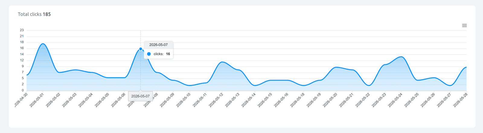
The chart is a filled line area chart where each point represents one day. The Y-axis shows click count; the X-axis shows dates.
Hover interaction: Hover over any point on the chart to see a tooltip showing the exact date and the number of clicks for that day (example: 2026-05-07 / clicks: 16).
Total clicks counter: Above the chart, the total click count for the selected time range is displayed (e.g. Total clicks 185). This reflects the sum of all daily values shown in the chart.
All clicks vs. unique clicks: From the Single plan and above, you can choose whether Cuttly counts all clicks or unique clicks per redirect. This setting affects the total clicks number and all charts. Free and Starter plans count all clicks only.
Exporting the chart: Click the ≡ (hamburger) icon at the top right of the chart to export it as PNG, JPEG, SVG, or download the chart data as CSV.
Find out more about the options available in your subscription plan here: Cuttly pricing and features
FAQ
What does the total clicks counter show?
It shows the sum of all clicks recorded for the link within the currently selected time range (last 7, 30, 90 days, or all). The number in the dashboard link list shows total all-time clicks and is not affected by the time range filter.
Can I track unique clicks?
Yes, from the Single plan ($25/month). You can choose to count either all clicks or unique clicks in your account settings. Unique click counting uses a 15-minute window on the Single plan and is configurable from 15 minutes to 24 hours on Team and Team Enterprise plans.
Can I export the chart?
Yes. Use the ≡ icon at the top right of the chart to export as image or CSV. The full analytics report including all charts can be downloaded as a PDF from the top of the analytics page.
-
What is Link Analytics?
How to view link analytics?
Time range filter (7 / 30 / 90 days / All)
Total Clicks Chart
Hourly Insights Heat Map
Source of Clicks (Facebook, Twitter, Instagram, LinkedIn, Direct)
Referrals / Other Sources
Devices Clicks (Desktop / Mobile / Other)
System (OS) Clicks
Browsers Clicks
Brand Clicks
Languages Clicks
Geo Location Clicks
Bots
Public and Private Analytics
Analytics Settings (per-link and global)
Download Analytics Report (.PDF)
Aggregated Link Analytics
Campaign Tag Analytics